11 Apr 2026

Site of
the Day

Morten Stig Christensen

by MSChristensen   japan

25     158

0
Design
0
Coding
0
Creativity
0
Total

VISIT WEBSITE

LATEST WINNERS

Viacheslav Novoseltsev

Portfolio website with Trail Image effect

04/04/26
375

Viacheslav Novoseltsev by Viacheslav Novosetsev  

Selflux – Nick Cristea

Archive and Portfolio covering over 30 years of digital products and experiences from Interaction Designer Nick Cristea

04/03/26
371

Selflux – Nick Cristea by Nick Cristea  

Reactive – Creative Web Design

The Reactive website showcases a modern, design-led approach to web design and development in London. Built to reflect our focus on clean aesthetics, performance and user experience, the site highlights our work, process and capabilities in creating high-impact digital experiences for ambitious brands.

04/01/26
365

LATEST NOMINEES

Laser & Me NYC

A full-service medical spa offering laser hair removal, skin rejuvenation, acne scar treatments, and Botox treatments for every skin type, delivered with precision and care in the heart of Manhattan.

04/11/26
15

Laser & Me NYC by Oleg Smirnov  

Atico3

Product design and engineering studio in Barcelona. UX/UI design and development on a monthly subscription. 15+ years, 100+ clients.

04/09/26
20

Atico3 by Atico3  

Qvery

Qvery builds AI agents that measure and grow brand visibility in ChatGPT and Google AI Mode. Built for marketers who want to know what AI search engines say about their brand.

04/08/26
145

Qvery by Qvery  

Chaima Ajimi – UI/UX Design Portfolio

A modern UI/UX portfolio showcasing user-centered design projects across web and mobile platforms. The website focuses on clean layout, strong visual hierarchy, and usability, presenting case studies in a clear and structured way.

Built with a minimalist approach, the design emphasizes readability, responsive behavior, and smooth user experience, highlighting work in SaaS, fintech, and product design.

03/26/26
370

Chaima Ajimi – UI/UX Design Portfolio by Chaima Ajimi UI UX Design  

Primo BHP

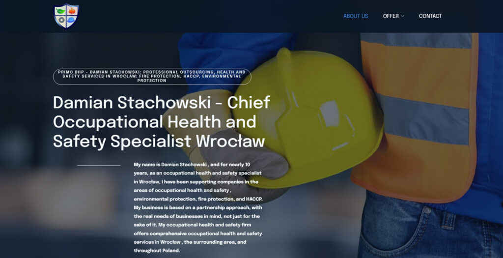
Primobhp is a modern website crafted for a specialist BHP (health and safety) company based in Wrocław, Poland. The design strikes a strong balance between professionalism and visual clarity, presenting complex services in an accessible and engaging way.

The layout is clean and highly functional, with a well-structured hierarchy that guides users effortlessly through the content. Generous spacing, clear typography, and a restrained color palette reinforce a sense of trust and reliability—key qualities for a safety-focused brand.

High-quality imagery plays an important role throughout the site, adding authenticity and visual interest without overwhelming the user. The images are thoughtfully integrated, supporting the content and enhancing the overall user experience.

Subtle interactions and smooth navigation contribute to a polished feel, while maintaining performance and usability across devices. The result is a refined, user-centered design that effectively communicates expertise and builds credibility.

Primobhp stands out as a strong example of how clean aesthetics and functional design can work together to create a professional and impactful web presence.

03/22/26
370

Primo BHP by Inbound Tom  

FINCORP

FINCORP is a Warsaw-based accounting firm that presents its services through a refined and thoughtfully crafted website design. The overall aesthetic is clean, modern, and highly functional, reflecting the precision and reliability expected from a financial services provider. From the first interaction, users are welcomed with a structured layout that prioritizes clarity, allowing them to quickly understand the scope of services and navigate the site with ease.

The design relies on a balanced use of whitespace, which enhances readability and creates a sense of order and professionalism. Typography is carefully selected to ensure legibility across all devices, while consistent spacing and alignment reinforce a cohesive visual identity. The color palette remains subtle and business-oriented, supporting the brand’s credibility without distracting from the content.

Imagery plays an important role in the overall experience. High-quality photos are integrated seamlessly into the layout, adding a human touch to the otherwise technical nature of accounting services. These visuals help build trust while maintaining a polished and corporate feel.

Functionality is at the core of the design. Key sections such as services, company information, and contact options are clearly defined and easily accessible. The user journey is intuitive, guiding visitors naturally from introduction to conversion points. Whether a user is looking for bookkeeping, payroll services, or accounting support for companies, the information is presented in a straightforward and digestible way.

Overall, the FINCORP website is a strong example of how clean design and usability can work together to elevate a professional service brand. It successfully combines aesthetic simplicity with practical functionality, resulting in a user-friendly experience that communicates trust, efficiency, and expertise.

03/22/26
370

FINCORP by Inbound TOM