Stacked
Site of the Day: 23 Jun 2021

11     29768

PUBLIC RATING

0
Design
0
Coding
0
Creativity
0
Total

RATE THIS SITE

Design

Coding

Creativity


ABOUT

Stacked

We’ve always had an idea of building a real estate team that wrote content not for the intention of selling, but to educate. The element of trust, warmth and openness was a main influence in our design.

Being a content-driven website, we decided to focus on an ‘editorial’ concept. We used warm pastel colours to emanate a feeling of homeliness with us. This was in stark contrast to the initial blue/white concept we came up with which we felt was too corporate-looking.

We settled on the dominant colour purple. It’s a very different colour from other real estate companies in Singapore, so this distinction sets us apart. We’ve also chosen several secondary colours that work harmoniously and have different meaning. The use of orange, blue and green represent the different types of housing in Singapore, and we deliberate pick the colours that represent which property type we are focusing on.

The use of lines that curve are common in our editorial. They separate our sections and form a part of our quotes and other icons. The lines dictate the flexibility and separation of space as part of our branding campaign, highlighting the versatility in our real estate expertise and knowledge. Moreover, these lines morph in to various icons such as the type of housing in Singapore – HDBs, condos and landed homes in our other branding assets.

The use of serif fonts here were deliberate. We wanted to give our readers the familiar feel of reading a journal, an editorial, a newspaper. A feel that they’re opening up a classic content that is serious. It is time to be informed.

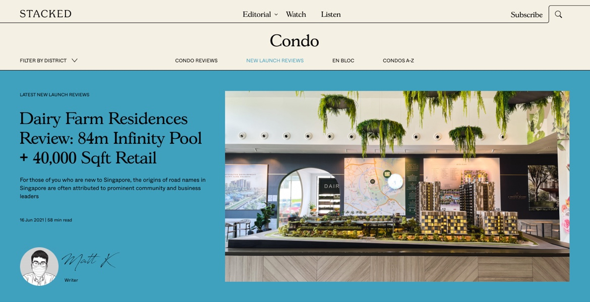
Our analysis, reviews and insights are derived from original photography, so the site takes advantage of multiple image layouts to bring the best out of our content – especially our reviews.

From our branding, we built a custom WordPress theme that you see here.

We hope you enjoyed this shot of our website.

Home

FEATURES

POSTED IN

LATEST NOMINEES

BUSY RADLIN

Busy Radlin — Bus & Coach Rental
A standout digital experience that brings professionalism and clarity to transportation services. The Busy Radlin website combines modern aesthetics with seamless functionality, reflecting the reliability and dynamism of a leading bus and coach rental company.

From the very first interaction, visitors are met with a crisp visual hierarchy, bold imagery of vehicles in motion, and intuitive navigation that makes trip planning effortless. Thoughtful use of typography and whitespace allows content to breathe, while vibrant accents guide the user’s attention to key services like fleet options, booking forms, and contact points.

The design excels in responsiveness and accessibility, ensuring the site feels equally polished on desktops, tablets, and mobile devices. Interactive elements — such as smooth hover states, animated transitions, and clear call-to-action buttons — enhance engagement without overwhelming the user.

Overall, Busy Radlin’s website delivers an elegant yet practical interface that not only showcases the company’s services but also builds trust and encourages conversions. It’s a perfect example of how user-centric design and purpose-driven visuals can elevate a service brand online.

12/21/25
10

BUSY RADLIN by Grzegorz Chlopecki  

KERN

KERN is a ski system made for confident glide, precise response, and stability in every phase of motion.

12/18/25
10

KERN by UPROCK  

AVISION

AVISION is a creative platform designed to help photographers, videographers, and designers showcase their work, connect with clients, and grow within a supportive community. We built a clean, content-first website that puts talent and portfolios at the center of the experience.

The design focuses on minimalism and clarity, eliminating visual noise to meet the high standards of creative professionals. Smart structure, intuitive filtering, and subtle motion bring the platform to life without distracting from the work itself. Minimal animations and an unconventional layout add character while keeping the interface light and focused.

12/16/25
10

AVISION by VALMAX