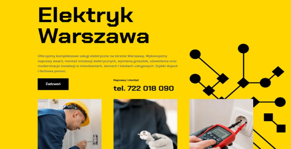
Categories

PORTMAN NIERUCHOMOŚCI

Portman is the online face of a dynamic real‑estate agency based in Otwock, Poland. The site instantly captures attention with a clean, modern layout that balances vibrant color accents with generous white space, creating a welcoming atmosphere for both buyers and sellers. Every visual element feels purposeful, turning the browsing experience into a seamless journey through Otwock’s property market.

Design & Visuals
The visual language is bold yet refined. A palette of bright blues, warm oranges, and subtle greys punctuates the interface, guiding the eye toward key calls‑to‑action and property highlights. High‑resolution photographs dominate the homepage, arranged in a responsive grid that adapts fluidly from desktop to mobile. Hover effects and subtle animations give each image a tactile feel, encouraging users to explore listings in depth.

User‑Centred Navigation
Navigation is intuitive: a sticky top bar houses the main menu—Home, Listings, About, Services, Blog, and Contact—while a secondary “quick‑search” bar lets visitors filter properties by type, price, and location without leaving the page. Breadcrumbs and clear pagination keep users oriented, and a sticky “Back to Top” button ensures effortless scrolling through image‑heavy sections.

WordPress Foundations
Built on WordPress, the site leverages a custom‑crafted theme that blends performance with flexibility. Advanced Custom Fields (ACF) power the property listings, allowing agents to input detailed specifications, floor plans, and multimedia galleries. The integration of the Elementor page builder provides a drag‑and‑drop workflow for future content updates, while Yoast SEO and WP Rocket keep the site fast, searchable, and secure.

Rich Content & Engagement
Beyond listings, Portman offers a blog that shares market insights, neighborhood guides, and client success stories, all presented in a clean, typographically balanced layout. Social media icons are subtly placed in the footer, encouraging cross‑platform interaction. A contact form, Google Maps embed, and live chat widget round out the conversion toolkit, making it easy for prospects to get in touch instantly.

Overall Impact
Portman exemplifies how a real‑estate agency can combine a vibrant, image‑driven aesthetic with robust WordPress functionality. The result is a polished, user‑friendly portal that showcases properties beautifully while delivering the performance and scalability needed for a growing business. This site stands out as a compelling case study for clean, colorful web design done right.

08/07/25
10

PORTMAN NIERUCHOMOŚCI by NETNAJEM  

Federico Cella

Product Designer portfolio

08/06/25
10

Federico Cella by Federico Cella  

Ivy Energy

Ivy Energy’s clean yet engaging website showcases the company’s multi-family solar and EV billing solutions providing intuitive resources for property owners and tenants.

08/06/25
10

Ivy Energy by Michael Cherkashin  

Psychotherapists * Warsaw

Therapy Warsaw presents a thoughtfully designed digital presence for a psychotherapy practice serving Warsaw’s international community since 2007. The website exemplifies how sensitive healthcare services can be communicated through clean, accessible design that prioritizes user trust and emotional safety.
The site features a minimalist aesthetic with careful typography and generous white space that creates a calming, professional atmosphere appropriate for mental health services. The information architecture is intuitively structured, guiding visitors through essential sections: individual therapy, couples counseling, consultation process, therapeutic approach, and practitioner profiles.
Key design strengths include:
• Thoughtful Content Hierarchy: Clear navigation between services (individual/couples therapy), methodology, and practical information
• Culturally Sensitive Design: Bilingual functionality serving both English and Polish speakers, with special attention to international community needs
• Trust-Building Elements: Transparent presentation of therapist credentials, methodologies (Process Oriented Psychology, psychodynamic approaches), and professional affiliations
• User-Centered Journey: Logical flow from initial consultation information to service details, respecting the sensitive nature of seeking psychological support
• Accessibility Focus: Clean typography and straightforward navigation that doesn’t overwhelm visitors who may be experiencing distress
The website successfully balances professional credibility with approachability, using design to reduce barriers for those seeking mental health support. It demonstrates how healthcare websites can maintain clinical professionalism while creating an inviting digital environment that reflects the practice’s therapeutic philosophy of careful exploration and understanding.

08/05/25
10

Psychotherapists * Warsaw by Couples Facilitation  

Flane

We are F•LANE.
A place that over the years has grown from a chill hookah bar into a restaurant with character, signature dishes, a cozy atmosphere and a team you want to come back to.

08/02/25
370

Flane by HOYDE studio  

JIII ATELIER

JIII ATELIER is a production office that mainly does web production, including design and develop by Yumi Nakaji.

08/01/25
365

JIII ATELIER by YUMI NAKAJI  

Mirage Studio Sebastian Rzymski

A refined portfolio and service site of Mirage Studio – an interior design atelier based in Warsaw, Poland. The page blends clean typography, soft animations, and structured grid layouts to present residential and commercial interiors with elegance and clarity. Built for intuitive navigation and high usability, the site reflects the studio’s minimalist yet expressive design approach. Responsive, SEO-optimized, and rich in custom visuals, it showcases contemporary interior architecture tailored to urban living.

07/31/25
10

Mirage Studio Sebastian Rzymski by Sebastian Rzymski  

Changer Capital ANRI

ANRI Inc. is a Changer Capital supporting visionary entrepreneurs who will transform the world for an overwhelming future.

07/31/25
370

Changer Capital ANRI by FunTech Inc.  

HNINE INTERACTION Department Brand Site

HNINE provides effective and flexible visual and technological solutions at the intersection of interaction design.

07/29/25
380

GRAWER GIFT

The Grawergift.pl gallery is a curated showcase of elegant, personalized engraved gifts designed to leave a lasting impression. Explore beautifully photographed crystal and glass awards, whiskey sets, vases, clocks, and heart-shaped keepsakes — each presented in high detail to highlight craftsmanship, engraving precision, and premium packaging.

From heartfelt dedications to stylish business recognitions, the gallery offers inspiration for all occasions — birthdays, anniversaries, corporate events, retirements, and more. Featured categories include Bohemia crystal, engraved decanters, business awards, and decorative timepieces, all displayed in tastefully arranged settings that bring each item to life.

Every image captures the charm and character of Grawergift’s offerings, giving visitors a clear sense of how their custom message can be transformed into a unique gift. Whether you’re browsing for a loved one or a professional milestone, the gallery reflects the high-quality artistry and emotional value behind every piece

07/27/25
10

GRAWER GIFT by NETNAJEM  

Crafto Web Agency

A bold, modern web agency website crafted with precision. Featuring smooth animations, smart use of whitespace, and striking typography—designed to impress creative agencies, freelancers, and digital studios alike. Fully responsive with a focus on visual impact and usability.

07/26/25
295

Crafto Web Agency by ThemeZaa  

F & L Jewelers

A chic, minimalist website for F & L Jewelers, designed to spotlight their exquisite collections with elegant simplicity. The site pairs clean lines and soft neutral tones to let the jewelry shine, featuring smooth navigation, stunning product galleries, and effortless browsing—an online experience as refined as their pieces.

07/22/25
370

F & L Jewelers by Northwood Digital Services