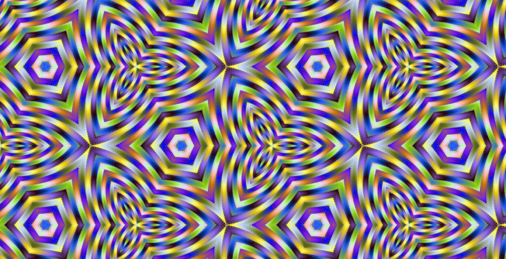
This was created with Spectrum Shift Paint, which is a Windows app that lets you paint with an animated brush. SSPaint also supports an export feature that allows you to export your animation as a set of webgl based web pages.
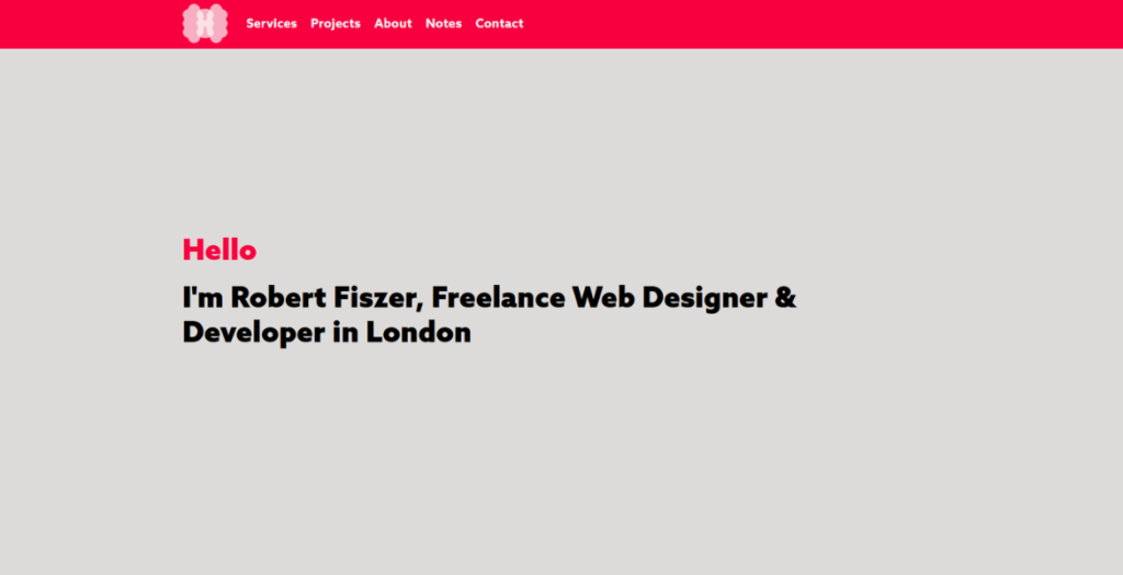
Portfolio of Robert Fiszer, London-based web designer. Built with Kirby CMS to demonstrate the approach: clean design, solid code, fast loading, and no unnecessary complexity.
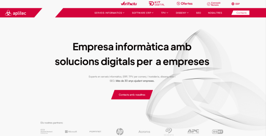
Aplitec Informàtica’s website reimagines the digital presence of a long-standing technology company through bold typography, architectural visual references and dynamic motion design. The interface blends clean layouts, subtle animations and structured content to communicate over 30 years of expertise in ERP software, IT infrastructure, POS systems and digital transformation, creating a modern and engaging browsing experience.
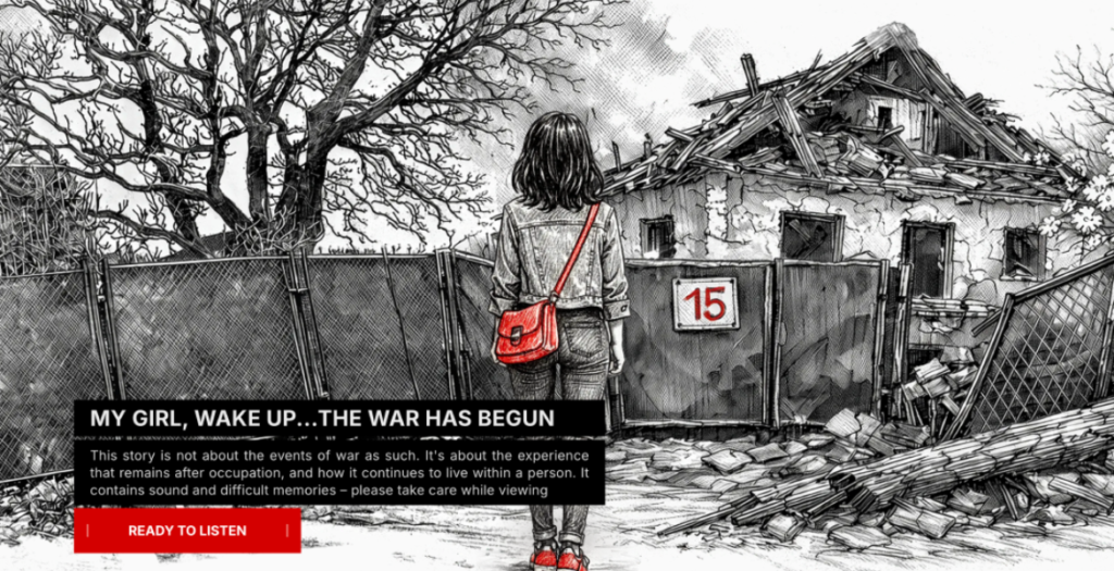
Ukrainska 15 is an interactive long-read that tells a personal story about the first days of the war in Ukraine. The project documents everyday moments, memories, and emotional experiences that often remain outside official narratives.
The website combines storytelling, illustration, and scroll-based interaction to recreate the atmosphere of uncertainty, fear, and resilience people experienced during that time. The narrative moves from darkness to light, symbolizing the journey from the basement during shelling to life continuing above ground.
Through a minimal visual language the project focuses on memory, trauma, and the human side of war. Ukrainska 15 is both a personal archive and a digital story about how ordinary life changes in extraordinary circumstances.
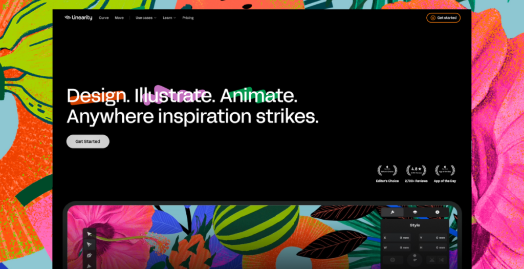
A redesign for Linearity’s website, shifting away from a marketing-led B2B approach to speak directly to illustrators, designers, and motion creators using Curve and Move.
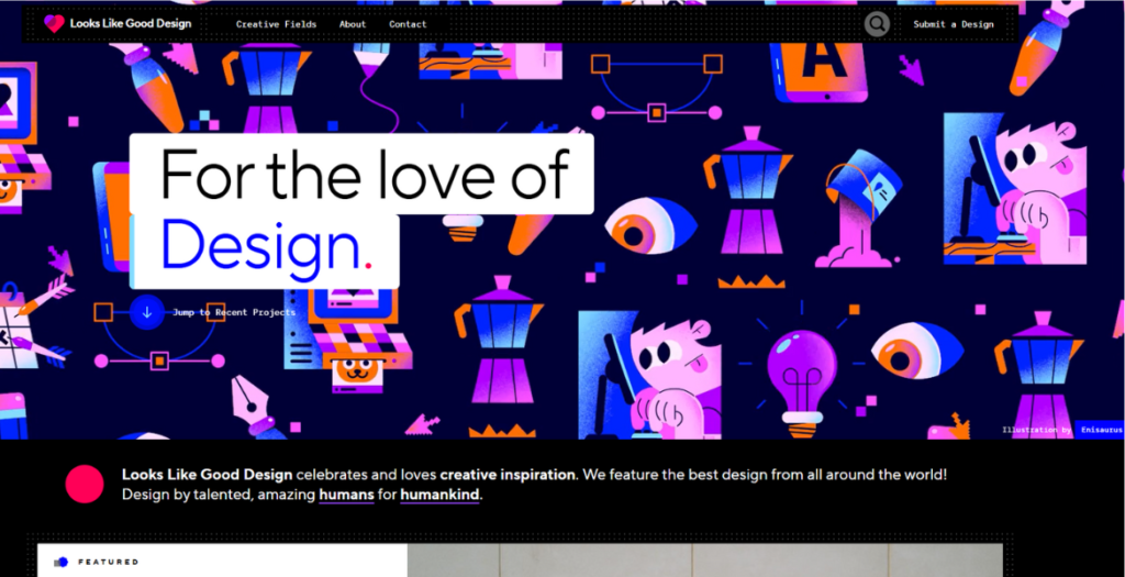
Looks Like Good Design is a curated design inspiration library built for people who care about their craft. Clean layouts, fast browsing, subtle motion, and short editorial notes that explain why a project works.
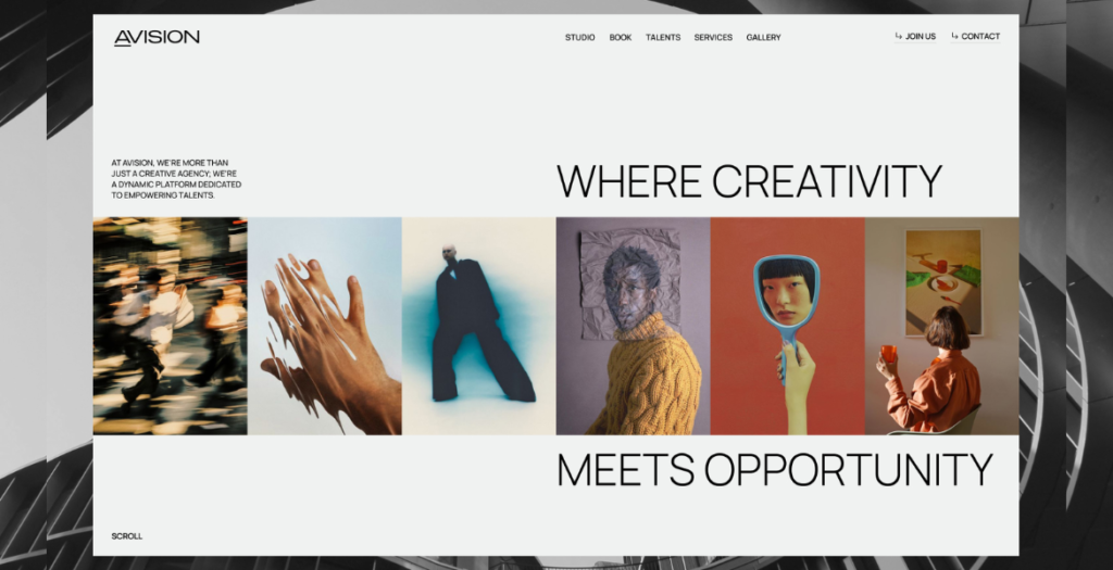
AVISION is a creative platform designed to help photographers, videographers, and designers showcase their work, connect with clients, and grow within a supportive community. We built a clean, content-first website that puts talent and portfolios at the center of the experience.
The design focuses on minimalism and clarity, eliminating visual noise to meet the high standards of creative professionals. Smart structure, intuitive filtering, and subtle motion bring the platform to life without distracting from the work itself. Minimal animations and an unconventional layout add character while keeping the interface light and focused.
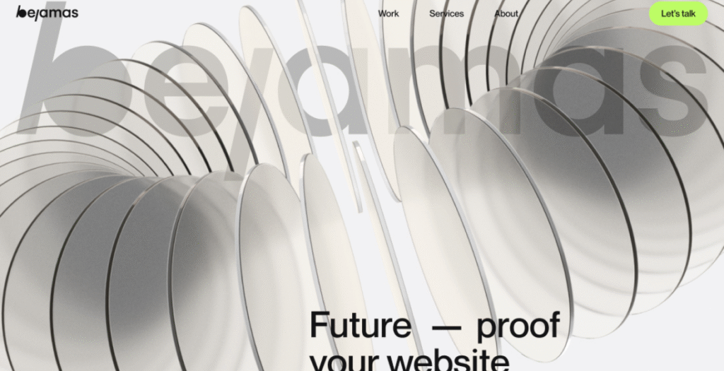
BUILDING BETTER WEBSITES.
We craft fast, scalable, and beautifully designed digital experiences. With a future-proof, platform-agnostic approach, we combine technology, design, and strategy to help brands grow with confidence.
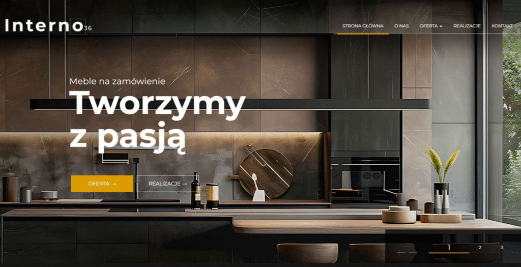
Interno36 is a modern studio specializing in custom-made furniture — including kitchens, wardrobes, and closets tailored to individual needs. The website features an elegant, minimalist design that reflects the brand’s premium character. With its clean layout and high-quality project photos, it stands as a great example of refined web design in the furniture industry.
We use cookies to ensure that we give you the best experience on our website. If you continue to use this site we will assume that you are happy with it.