Ikshaa Designs is an Indian handcrafted lifestyle and fashion brand that specializes in traditional textiles and artisan-made products. The brand emphasizes “Crafted with Care” and showcases handloom craftsmanship with contemporary styling.
Brand Positioning
Handmade and artisan-crafted products
Women-led and eco-friendly positioning (as reflected in its social presence)
Focus on preserving traditional Indian craftsmanship while offering modern designs.
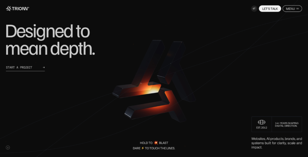
TRIONN® is an independent AI-powered digital design and development studio helping ambitious brands create meaningful digital experiences through strategy, design, and technology.
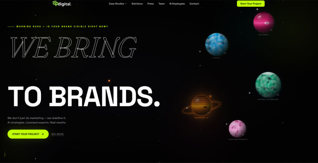
Up Digital is an AI-powered agency reimagined as an interactive universe. Visitors explore orbiting client planets, immersive storytelling, cinematic transitions, and a custom AI strategist while discovering branding, advertising, web experiences, social media, and AI automation services. A bespoke onboarding journey, interactive rocket-building experience, custom animations, and motion-driven design transform traditional agency navigation into an engaging digital adventure.
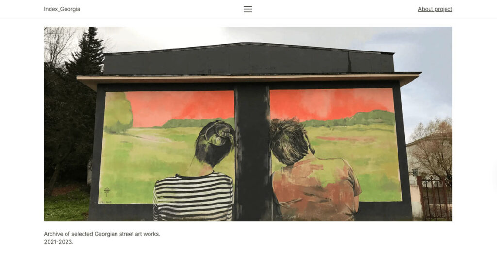
Index_Georgia operates at the intersection of visual research, a cataloguing system, and a contemporary archive documenting the evolving street art landscape of Georgia. This cultural essay was built as a strict typographic experiment in the Swiss Style: featuring a 4-column grid and utilizing only a single font weight of Inter, chosen as a digital homage to Akzidenz-Grotesk.
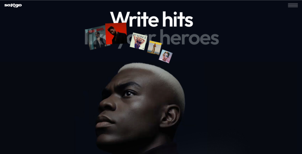
Discover how hit songs are made with Songo – the AI-powered tool for visual song analysis, structure, patterns, and pro-level songwriting insights. Upload, explore, create.
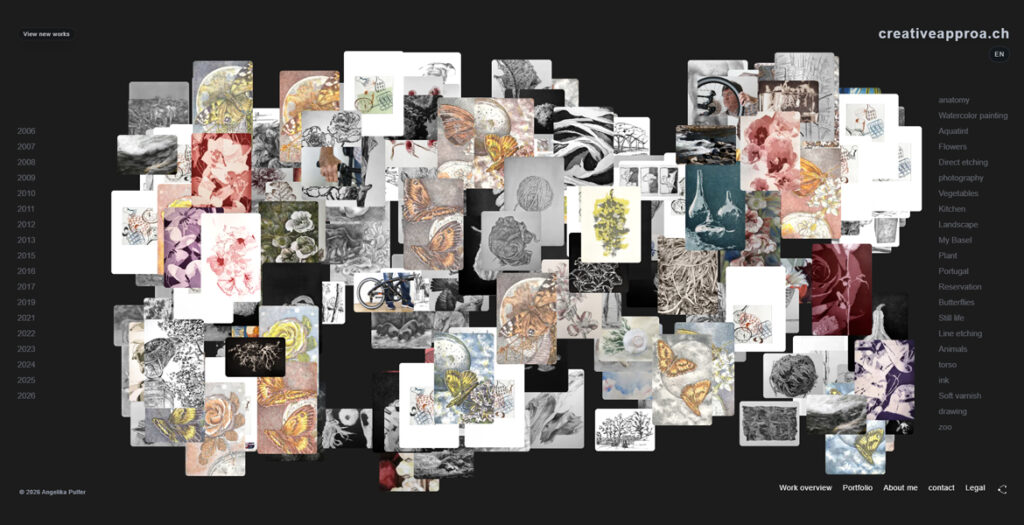
creativeapproa.ch is an interactive artist website by Angelika Pulfer, built around a free-floating image cloud of works, texts and visual traces. Instead of presenting the archive as a fixed chronology, the site invites visitors to move through images by year, motif, technique and association.
The project brings together drawing, printmaking, photography, observation and digital composition in an open web space. Individual works can be explored through focused views, while curated texts offer a second layer of reflection on materials, processes, motifs and recurring forms. The result is both an artist portfolio and a living archive: quiet, exploratory and shaped by the act of looking.
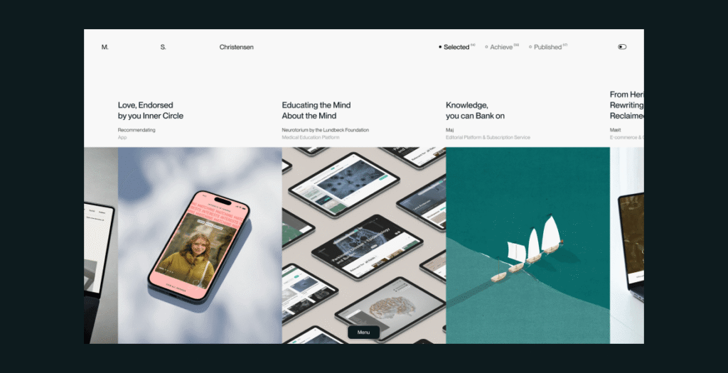
Portfolio of Morten Stig Christensen, a digital designer & developer crafting thoughtful digital experiences through clarity, interaction, storytelling, and craft.
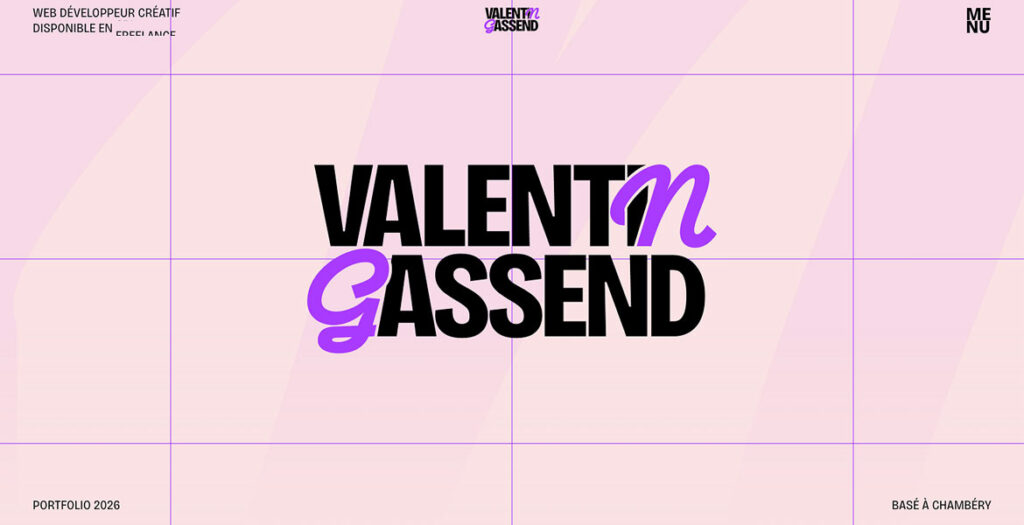
Portfolio of Valentin Gassend, a freelance Creative Developer specializing in immersive web experiences. Built with Next.js, the site explores the intersection of design and code through custom WebGL shaders (React Three Fiber), advanced kinetic typography (GSAP), and smooth scrolling interactions. It features in-depth case studies and a dedicated experimental “Lab” for front-end R&D.
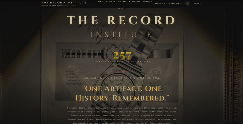
The Record Institute is a specialized digital museum and archival platform dedicated to the preservation and study of original print advertisements from the 1930s through the 1990s. Operating at the intersection of historical preservation and digital innovation, the site serves as a sanctuary for “The Aesthetics of Decay,” showcasing original single-sheet artifacts extracted from iconic publications. Through high-fidelity rendering, magnifying zoom capabilities, and an academic narrative, the platform elevates commercial ephemera into a recognized form of historical art, emphasizing the tactile soul of paper that predates the digital revolution.
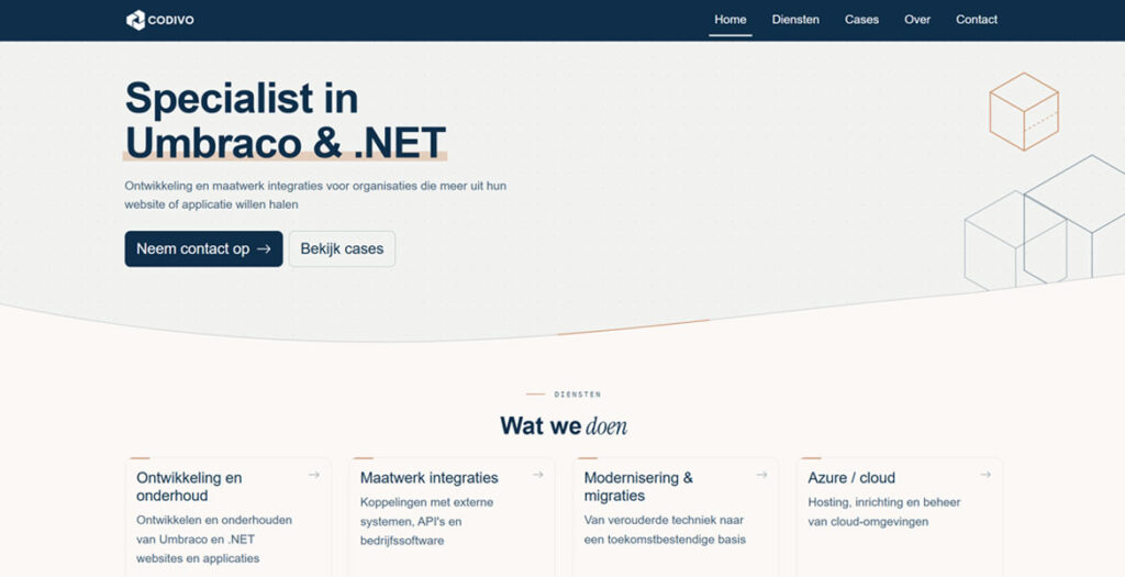
Codivo is an Umbraco and .NET specialist based in Zwolle, the Netherlands. We build and maintain custom websites, web applications and integrations for organisations that want more out of their digital platform.
The website is a minimalist design with a warm cream-and-navy palette, a single coral accent and plenty of whitespace. Subtle reveals replace heavy animation, letting the content lead.
We use cookies to ensure that we give you the best experience on our website. If you continue to use this site we will assume that you are happy with it.