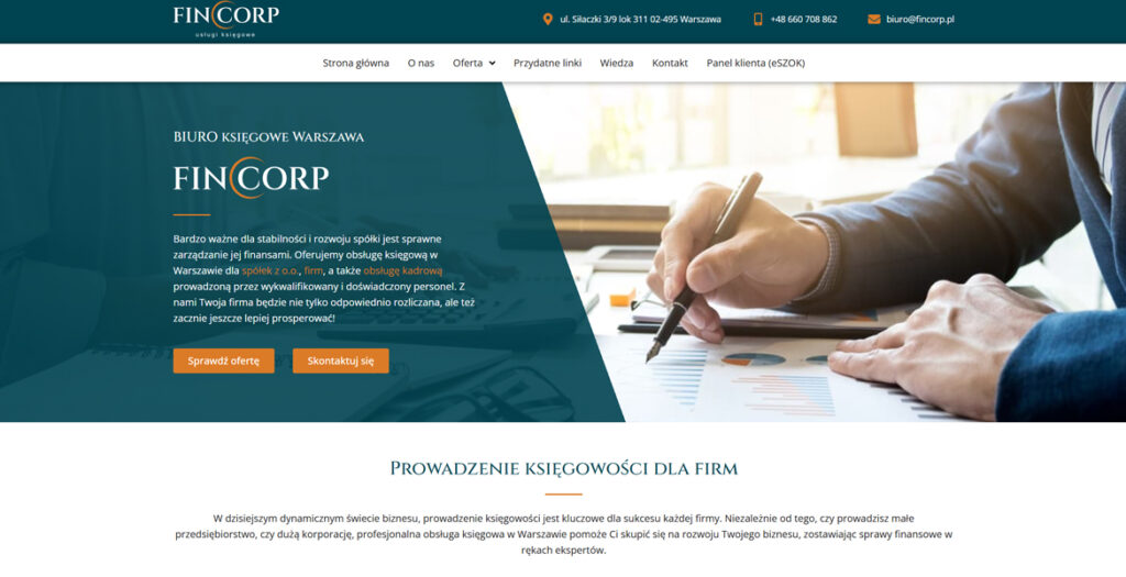
The Mini-MBA for Designers & Creatives website by Future London Academy bridges the gap between design and business. Yellow leads the identity as our central brand colour — bright, confident, and unmistakably energetic — supported by a high-contrast palette that keeps momentum across pages. An interactive hero animation visualises the programme’s promise: designers can connect craft to commercial impact — and make it spark. Throughout the system, linework blends business graph language with design curves; dots double as data points and the “handles” of Bézier paths, symbolising control, iteration, measurable outcomes but also fun and creativity.
An elegantly designed e-commerce specializing in a curated selection of esoteric and spiritual products. The website offers a seamless user experience with intuitive navigation, refined aesthetics, and secure purchasing options, catering to an audience seeking high-quality mystical and wellness items.
An Apothicaria is more than just a smoke shop. We’ve got everything you could possibly imagine to have a good time. Every store is stocked with all the Cheech & Chong goods – from our legendary gummies and drinks, to premium flower, vapes and accessories.
ComPsych is the world’s largest provider of employee assistance programs (EAP), and supports over 130 million people in more than 190 countries. They came to us to reimagine their 40 year old brand and redefine their strategy and visual identity. They were pretty old-school and they had a lot of new fancy startups with cool branding gnawing at their heels, so the goal was to help them solidify their position as the actual market leader.
We took the time (outside our scope with them) to put together a brand website that consolidates this new direction.
Built with a mobile-first, modular approach, the design emphasizes fluidity, responsiveness, and seamless interaction. Organic animations, custom iconography, and a restrained color scheme create an immersive experience that feels both futuristic and human.
We redesigned the website for the Sacramento Regional Transit District. The website is designed to help travelers in Sacramento find the best ways to commute throughout the city using public transit system. We did a complete redesign of their website that included :
– Strict adherence to the brand style guide
– Animated hero image
– A real time trip planner custom widget, that matched their brand colors, icons and gave step by step details of a route to take from place A to place B
– A News section with up-to-date information and PR
– A Schedules calendar
– Real time Alerts about transit delays and weather alerts
– A Lot More
Introducing “ECARPOWER” – your premier destination for cutting-edge electric vehicle charging solutions in Poland. Our website showcases a sleek and user-friendly design, mirroring the efficiency of our charging stations. Immerse yourself in a virtual tour of our state-of-the-art facilities, strategically located across the country for your convenience.
Therapy Warsaw presents a thoughtfully designed digital presence for a psychotherapy practice serving Warsaw’s international community since 2007. The website exemplifies how sensitive healthcare services can be communicated through clean, accessible design that prioritizes user trust and emotional safety.
The site features a minimalist aesthetic with careful typography and generous white space that creates a calming, professional atmosphere appropriate for mental health services. The information architecture is intuitively structured, guiding visitors through essential sections: individual therapy, couples counseling, consultation process, therapeutic approach, and practitioner profiles.
Key design strengths include:
• Thoughtful Content Hierarchy: Clear navigation between services (individual/couples therapy), methodology, and practical information
• Culturally Sensitive Design: Bilingual functionality serving both English and Polish speakers, with special attention to international community needs
• Trust-Building Elements: Transparent presentation of therapist credentials, methodologies (Process Oriented Psychology, psychodynamic approaches), and professional affiliations
• User-Centered Journey: Logical flow from initial consultation information to service details, respecting the sensitive nature of seeking psychological support
• Accessibility Focus: Clean typography and straightforward navigation that doesn’t overwhelm visitors who may be experiencing distress
The website successfully balances professional credibility with approachability, using design to reduce barriers for those seeking mental health support. It demonstrates how healthcare websites can maintain clinical professionalism while creating an inviting digital environment that reflects the practice’s therapeutic philosophy of careful exploration and understanding.
We use cookies to ensure that we give you the best experience on our website. If you continue to use this site we will assume that you are happy with it.