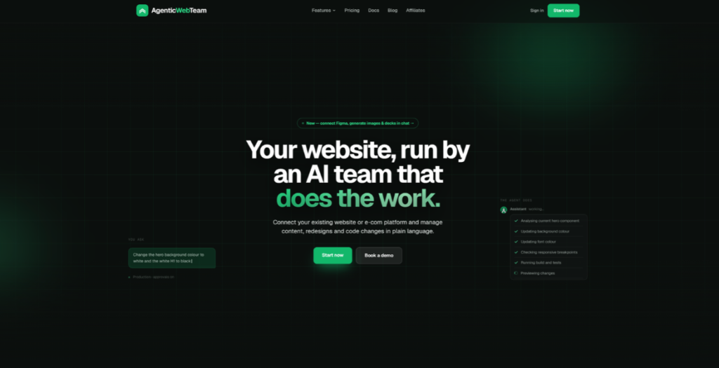
AgenticWebTeam is an AI web team that runs your website from a chat. The site itself practises what it sells: a single dark design system in Geist, brand-green aurora gradients, ghost display type, and numbered tiles with stroked numerals that ignite on hover. Everything moves with intent — an animated SEO dashboard that cycles a five-phase agent loop, hand-built phone mocks with live waveforms and a Face-ID scan sweep, persona circles that drop in with a squash-and-bounce, and an interactive ROI calculator. Built with Astro, vanilla CSS animations and the Web Animations API — no animation libraries — with prefers-reduced-motion respected throughout.
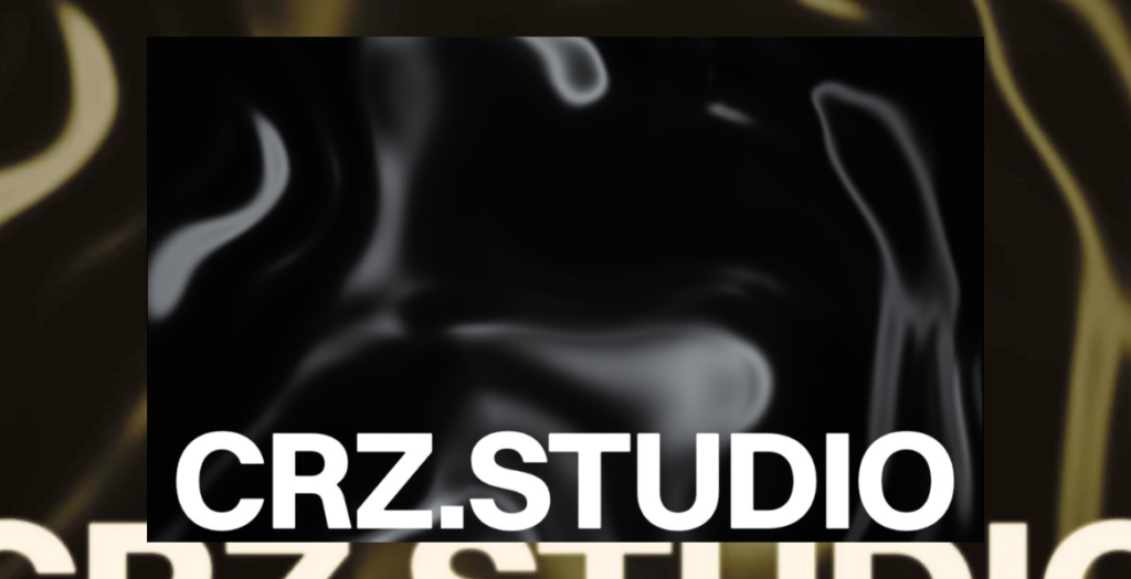
CRZ.STUDIO is a personal studio site exploring performance-driven creative development, where design, code, and motion merge into a single interactive system.
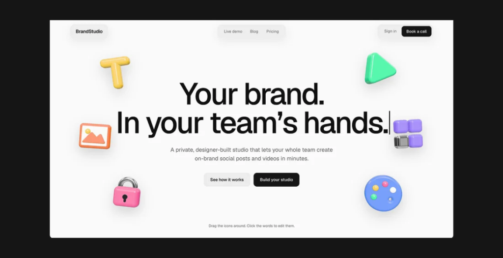
A showcase website designed and built to bring an innovative brand content platform to life, combining engaging storytelling, interactive experiences and a polished visual identity.
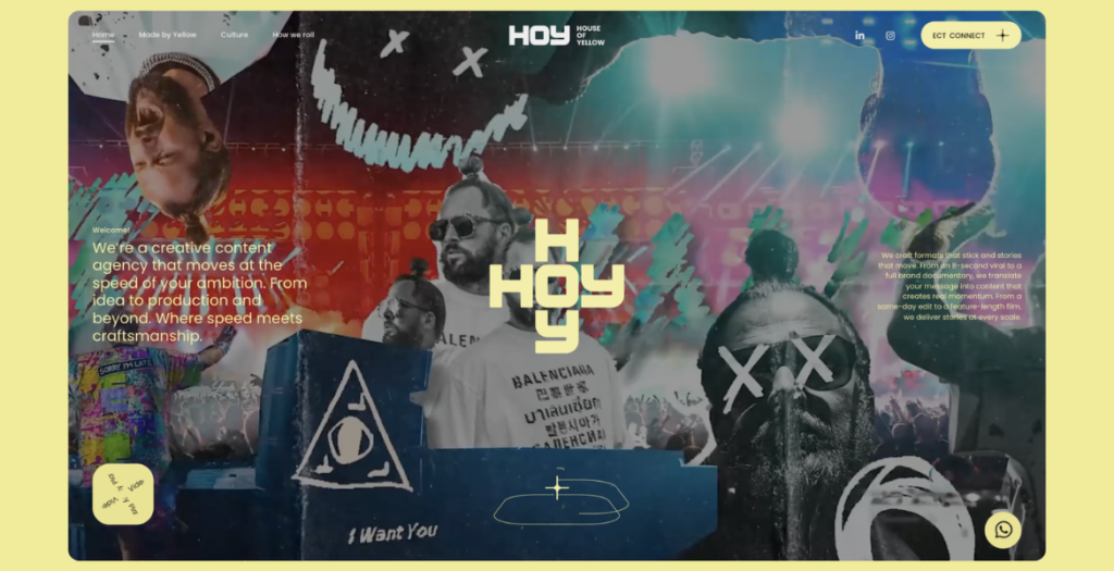
HOY is a creative content agency that moves at the speed of your ambition. Build with firepower, we take ideas from concept to production and beyond. Where speed meets craftsmanship.
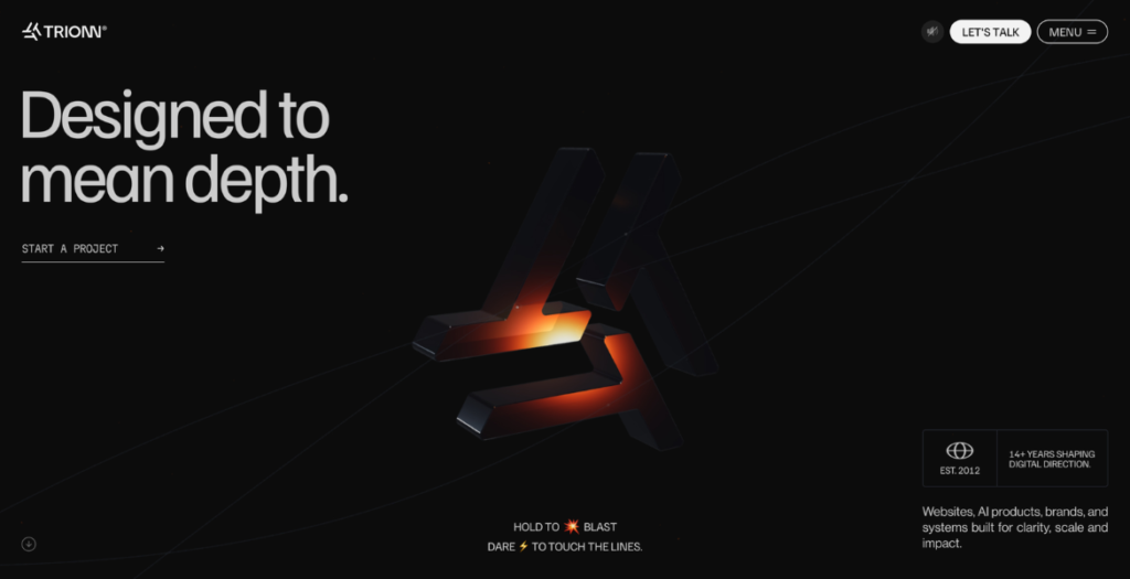
TRIONN® is an independent AI-powered digital design and development studio helping ambitious brands create meaningful digital experiences through strategy, design, and technology.
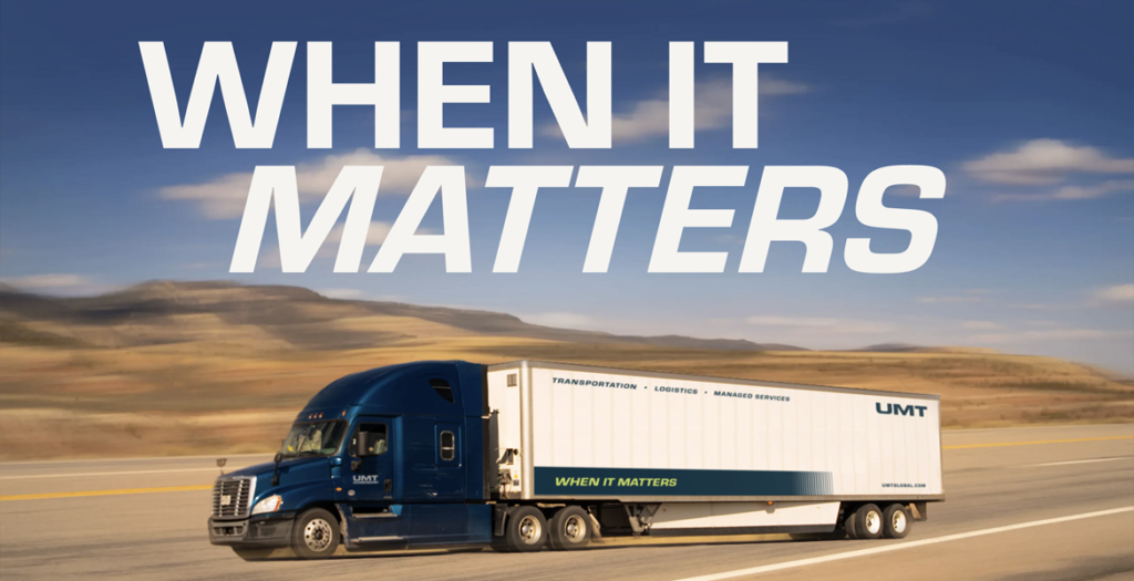
Atomicdust created a new brand identity for UMT, reflecting the strength of their operations across transportation and logistics. With the brand in place, it was time to express it online.
The new UMT website is dynamic and vibrant. Deep navy contrasts with lime-green—an unexpected palette for logistics that keeps the site modern and memorable. Bold headlines convey confidence, and audience-based navigation means visitors don’t have to do any guesswork. Animated stats, client logos and approachable photography emphasize UMT’s trustworthiness. An icon-based visual language to communicate the company’s security and technology eliminate the need for dense paragraphs. Soft transitions between sections encourage the reader to keep exploring more.
Now, UMT has a powerful site that supports sales, and shows the standards behind its service before a shipment ever leaves the dock.
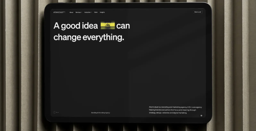
How does a website design agency launch a website for itself? For us, it took a lot of debate, innovation and precision.
We built a fully custom WordPress theme with motion and video throughout: big animated headlines, hover states and full-motion clips built from project imagery to guide (and keep) visitors’ attention. It’s all set on a Swiss grid, so even with the unexpected elements, tension from juxtaposition and motion, the experience stays digestible and orderly.
The power of the new site isn’t just aesthetics though. Twelve interactive tools invite visitors to get a free audit within seconds, reporting back on their brand, website accessibility, SEO, AI readiness and more. The tools drive leads and turn the site into an impressive experience for the audience. Finally, the site’s structure supports rapid iteration: custom landing pages, blog-to-portfolio conversions and social content can all spin up in minutes.
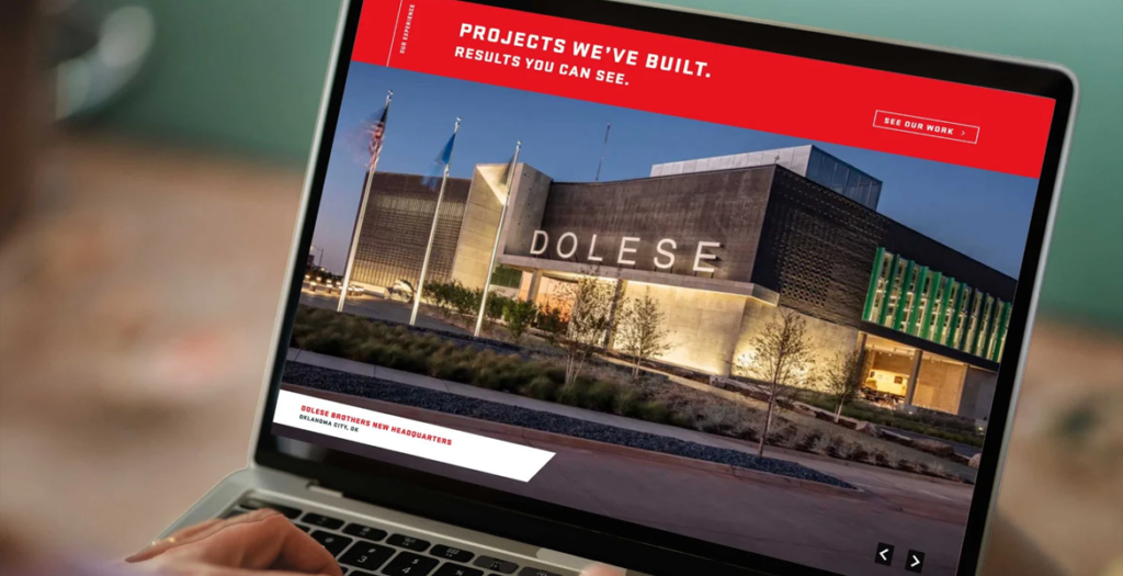
Flintco delivers comprehensive construction services for complex projects around the country. After refreshing the firm’s brand identity to be more modern, bold and reflective of the company’s position, we turned to their website.
The new site is visually striking, but that’s just the beginning. Animation and interactivity guide the visitor as they learn about Flintco and find what they need. The new tagline, “All in. Always.” is palpable, with real jobsite photos, stats and case studies not just telling, but showing, Flintco’s expertise and impact. On the backend, we developed a custom digital brochure builder that makes it easier for Flintco’s business development team to assemble sales materials—customizable but still consistent, and without having to start from scratch every time.
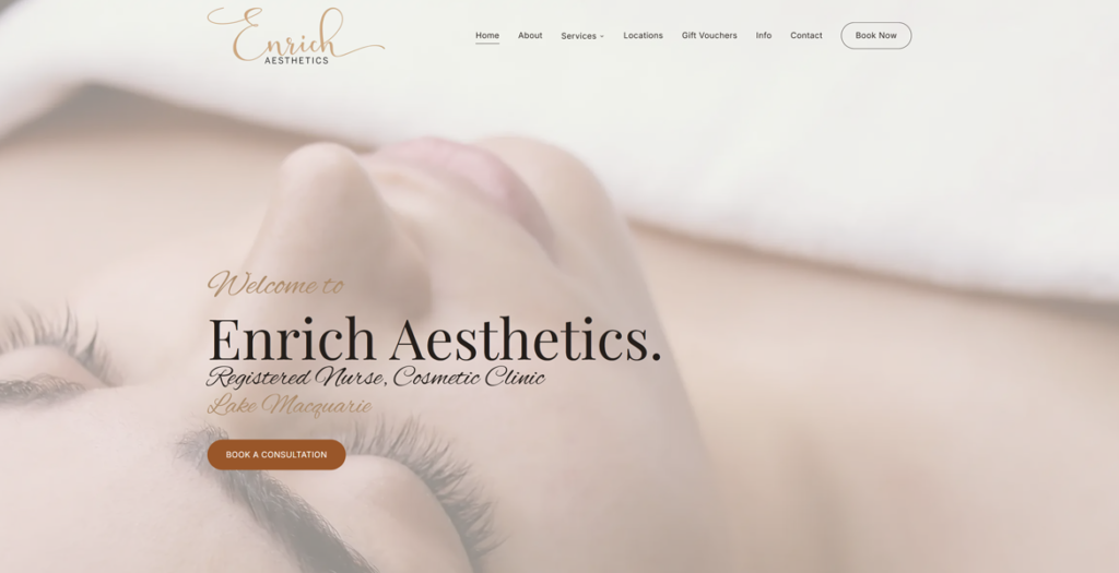
Enrich Aesthetics is a registered nurse cosmetic clinic in Lake Macquarie, NSW.
The design has to earn trust without testimonials or heavy before-and-after photos, because Australian advertising law rules both out.
So it leans on calm, near-white space, an Alex Brush script logotype and Playfair Display headings set against Inter body text.
Every heading fades in one letter at a time as you scroll, and Lenis smooth scrolling keeps the pace slow and considered. It is a fully custom Astro build styled with Tailwind CSS and animated with GSAP.
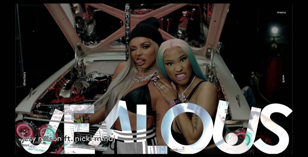
A creative production studio brought to life through movement. A cinematic digital experience where projects, directors and stories flow seamlessly into one immersive portfolio.
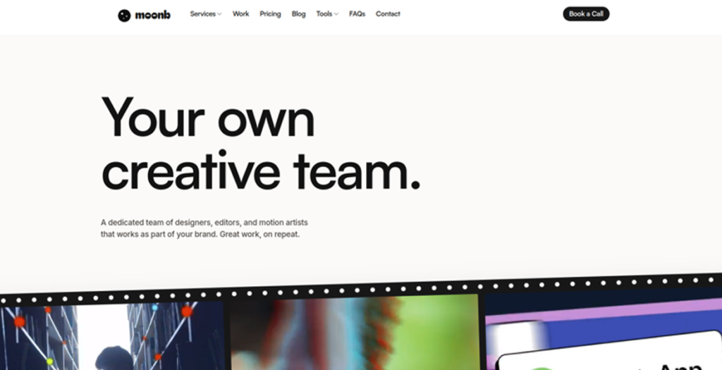
A creative studio that gives companies a dedicated creative director and production team, working as an extension of their own. Video, motion, design, and animation, on an ongoing basis. New work, every week.
We use cookies to ensure that we give you the best experience on our website. If you continue to use this site we will assume that you are happy with it.