Design Leadership Webinar Series

Design-Leadership-Webinar-S
Site of the Day: 30 Aug 2023

7     6118

PUBLIC RATING

0
Design
0
Coding
0
Creativity
0
Total

RATE THIS SITE

Design

Coding

Creativity


ABOUT

Design Leadership Webinar Series

To celebrate the Design Leaders Programme, Future London Academy hosted a series of Design Leadership Webinars with some of the world’s best Chief Creative Officers. We invited Webinar guests from R/GA, Saatchi & Saatchi, Atlassian, BCW Global, and Mejuri to talk about how they got to the Chief Creative Officer position, solving bigger problems and leading bigger teams.

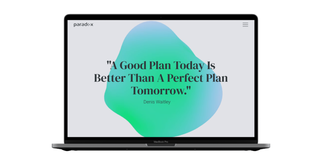
Future London Academy’s design team created a bright playful identity for the series to showcase all of the amazing creative leaders and design leadership at large.

A design career, or in fact any career journey, may sometimes feel like a quest… or even a video game! You pass some challenges, you fail at others, you gain bonuses, and extra lives, at times you may have to start over again, and finally you can move on to the next level (where you go through the same cycle of challenges once again!).

With that metaphor in mind, Future London Academy’s team used the 90s video game aesthetic as the main inspirational source. Pixel graphics and recognisable game elements such as hearts, keys, and dollar signs became the central elements of the identity.

Even though leadership to some people may sound very serious, strict and grown-up, Future London Academy believes that it can be fun, inspiring, creative and unconventional. That’s why the identity is extremely colourful, juicy and bright.

We encourage you to explore the https://cco.futurelondonacademy.co.uk website to discover the wealth of knowledge and expertise it holds. Whether you are a seasoned design professional seeking to enhance your leadership skills or a budding creative looking to delve into the world of design, you will find valuable insights and inspiration through our webinars.

FEATURES

LATEST NOMINEES

Primo BHP

Primobhp is a modern website crafted for a specialist BHP (health and safety) company based in Wrocław, Poland. The design strikes a strong balance between professionalism and visual clarity, presenting complex services in an accessible and engaging way.

The layout is clean and highly functional, with a well-structured hierarchy that guides users effortlessly through the content. Generous spacing, clear typography, and a restrained color palette reinforce a sense of trust and reliability—key qualities for a safety-focused brand.

High-quality imagery plays an important role throughout the site, adding authenticity and visual interest without overwhelming the user. The images are thoughtfully integrated, supporting the content and enhancing the overall user experience.

Subtle interactions and smooth navigation contribute to a polished feel, while maintaining performance and usability across devices. The result is a refined, user-centered design that effectively communicates expertise and builds credibility.

Primobhp stands out as a strong example of how clean aesthetics and functional design can work together to create a professional and impactful web presence.

03/22/26
15

Primo BHP by Inbound Tom  

FINCORP

FINCORP is a Warsaw-based accounting firm that presents its services through a refined and thoughtfully crafted website design. The overall aesthetic is clean, modern, and highly functional, reflecting the precision and reliability expected from a financial services provider. From the first interaction, users are welcomed with a structured layout that prioritizes clarity, allowing them to quickly understand the scope of services and navigate the site with ease.

The design relies on a balanced use of whitespace, which enhances readability and creates a sense of order and professionalism. Typography is carefully selected to ensure legibility across all devices, while consistent spacing and alignment reinforce a cohesive visual identity. The color palette remains subtle and business-oriented, supporting the brand’s credibility without distracting from the content.

Imagery plays an important role in the overall experience. High-quality photos are integrated seamlessly into the layout, adding a human touch to the otherwise technical nature of accounting services. These visuals help build trust while maintaining a polished and corporate feel.

Functionality is at the core of the design. Key sections such as services, company information, and contact options are clearly defined and easily accessible. The user journey is intuitive, guiding visitors naturally from introduction to conversion points. Whether a user is looking for bookkeeping, payroll services, or accounting support for companies, the information is presented in a straightforward and digestible way.

Overall, the FINCORP website is a strong example of how clean design and usability can work together to elevate a professional service brand. It successfully combines aesthetic simplicity with practical functionality, resulting in a user-friendly experience that communicates trust, efficiency, and expertise.

03/22/26
15

FINCORP by Inbound TOM  

Tomasz “ITom” Szmajda Portfolio

Tomasz ‘ITom’ Szmajda’s creative developer portfolio is an interactive 3D journey that bridges the gap between digital art and web engineering. The experience welcomes users with a unique 2D-to-3D transition, where a paper canvas physically “tears” apart using GSAP-driven SVG animations.

Inside the 3D space, visitors navigate an infinite museum corridor. Pencil-sketched picture frames line the walls, coming to life through custom WebGL shaders (RevealMaterial) that organically “paint” the colors onto the canvas upon interaction.

The portfolio features multiple bespoke rooms, including “The Studio”—an interactive, physics-based cylindrical tower of monitors that users can swipe to spin or scroll to trigger an infinite vertical fall. Built with React Three Fiber, the experience is highly optimized, featuring dynamic FPS-based quality scaling and dedicated accessibility overlays, proving that high-end 3D web experiences can be both visually stunning and accessible.

03/22/26
30

Tomasz “ITom” Szmajda Portfolio by Tomasz "ITom" Szmajda