
Index Press: A signal in the noise

Index-Press-1
Site of the Day: 30 May 2024

39     240

PUBLIC RATING

0
Design
0
Coding
0
Creativity
0
Total

RATE THIS SITE

Design

Coding

Creativity


ABOUT

Index Press: A signal in the noise
OVERVIEW
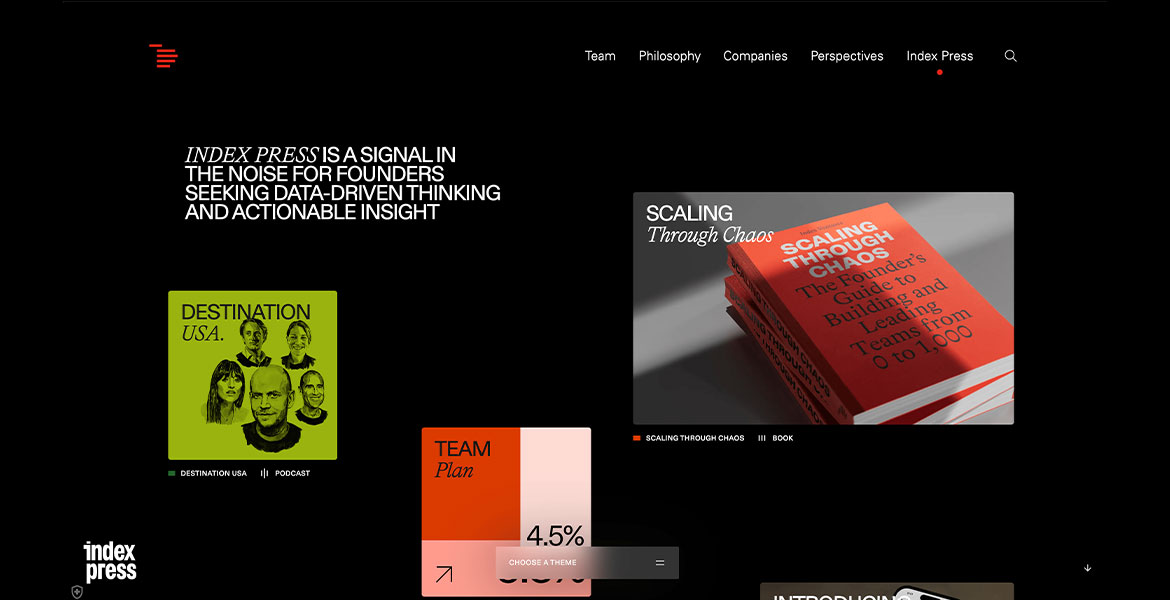
One of the world’s pre-eminent venture capital investors, Index, came to us with a challenge: how to create a brand that will deliver valuable insights to founders in a landscape already saturated with content? Together, we launched Index Press.

Manifesting as a series of books and a new resources hub, featuring podcasts, articles, and interactive app, Index Press is built around the notion of being ‘A Signal in the Noise’. This idea that emphasises the practical, cut-through nature of their advice, sourced directly from the people and companies Index know like no others.

THE SOLUTION
The decision to create a brand was taken in order to provide a defined space for the new content, avoiding crowding Index’s core venture comms. The identity has its roots in Index’s well established visual identity, but introduces a contemporary, publishing-inspired, editorial flavour.

With a multi-format approach mandatory for an audience of busy company builders, our identity works from the mobile screen to the printed page, supporting long form content, digital tools, podcasts and everything in between, thanks to a versatile, system-driven set of assets.

THE DIGITAL EXPERIENCE
The user experience challenge presented by the amount and the variety of the content became central to its solution. Inspired by the Signal in the Noise positioning, nearly all the content is surfaced, with a UI that makes selection and navigation to specific things easy and rewarding, with tagging, indexing and categorisation familiar in both the physical and digital world. The result is an experience where users feel the depth and breadth of the content, but can easily navigate to what they need.

THE DETAILS DETAILS DETAILS
Communicating the meticulousness and detail synonymous with Index’s work was essential. These qualities manifest in every aspect of the brand, with a level of craftsmanship inherent in the illustration, data visualisation and application of the identity across different media.
FEATURES

LATEST NOMINEES

Paradox

A living blob of light navigates users through a systemic coaching practice – breathing, morphing, reacting to every move. One shape, infinite states. Form follows feeling.

07/16/26
365

Paradox by RNDM design studio  

Elektryk Warszawa

Elektryk Warszawa is a modern service website designed to demonstrate how a local business can establish a strong and trustworthy online presence through clean design and thoughtful user experience. Instead of relying on unnecessary visual effects, the project emphasizes simplicity, clarity, and functionality. A minimalist layout, carefully balanced typography, and a limited color palette create a professional appearance while allowing visitors to quickly find the information they need.

The website was built with a mobile-first approach, ensuring smooth navigation and excellent performance across all devices. Every section is structured to guide users naturally through the content, from the introduction and services to testimonials and contact information. Attention was also given to accessibility, readability, loading speed, and SEO-friendly architecture, creating a balance between aesthetics and technical quality.

The result is a fast, responsive, and conversion-focused website that reflects the reliability of a professional electrical services company. By combining modern web design principles with practical usability, Elektryk Warszawa delivers a seamless browsing experience while maintaining a clean, elegant visual identity that supports both users and search engines.

07/15/26
15

Elektryk Warszawa by Itsolutions  

Get Dashboard Templates

A catalogue of 65 hand-built dashboard interfaces, each delivered as a single self-contained HTML file: no framework, no build step, no external scripts, with every chart hand-drawn in SVG and canvas. Each design is themed to a real operation (a brewery, an airline operations desk, an auction house, a rail freight line) and no two share a skeleton or a palette. Built as a deliberate counter to the uniform look of generated interfaces.

07/12/26
10