Site of the Day: 12 Aug 2025
35 259
PUBLIC RATING
RATE THIS SITE
ABOUT
PORTMAN NIERUCHOMOŚCI
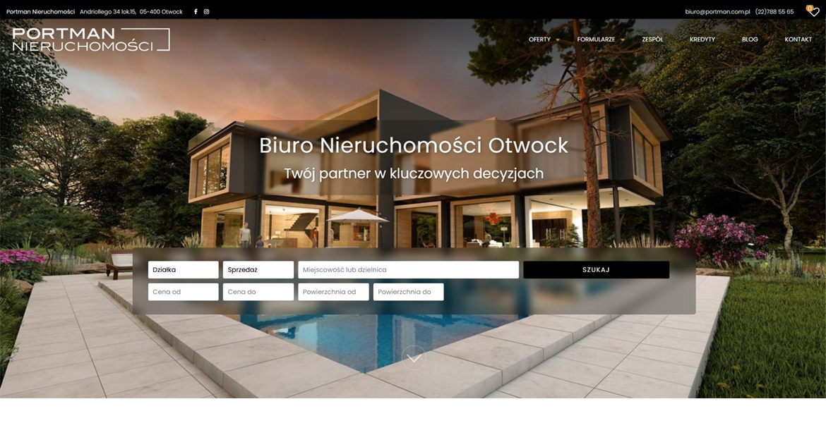
Portman is the online face of a dynamic real‑estate agency based in Otwock, Poland. The site instantly captures attention with a clean, modern layout that balances vibrant color accents with generous white space, creating a welcoming atmosphere for both buyers and sellers. Every visual element feels purposeful, turning the browsing experience into a seamless journey through Otwock’s property market.
Design & Visuals
The visual language is bold yet refined. A palette of bright blues, warm oranges, and subtle greys punctuates the interface, guiding the eye toward key calls‑to‑action and property highlights. High‑resolution photographs dominate the homepage, arranged in a responsive grid that adapts fluidly from desktop to mobile. Hover effects and subtle animations give each image a tactile feel, encouraging users to explore listings in depth.
User‑Centred Navigation
Navigation is intuitive: a sticky top bar houses the main menu—Home, Listings, About, Services, Blog, and Contact—while a secondary “quick‑search” bar lets visitors filter properties by type, price, and location without leaving the page. Breadcrumbs and clear pagination keep users oriented, and a sticky “Back to Top” button ensures effortless scrolling through image‑heavy sections.
WordPress Foundations
Built on WordPress, the site leverages a custom‑crafted theme that blends performance with flexibility. Advanced Custom Fields (ACF) power the property listings, allowing agents to input detailed specifications, floor plans, and multimedia galleries. The integration of the Elementor page builder provides a drag‑and‑drop workflow for future content updates, while Yoast SEO and WP Rocket keep the site fast, searchable, and secure.
Rich Content & Engagement
Beyond listings, Portman offers a blog that shares market insights, neighborhood guides, and client success stories, all presented in a clean, typographically balanced layout. Social media icons are subtly placed in the footer, encouraging cross‑platform interaction. A contact form, Google Maps embed, and live chat widget round out the conversion toolkit, making it easy for prospects to get in touch instantly.
Overall Impact
Portman exemplifies how a real‑estate agency can combine a vibrant, image‑driven aesthetic with robust WordPress functionality. The result is a polished, user‑friendly portal that showcases properties beautifully while delivering the performance and scalability needed for a growing business. This site stands out as a compelling case study for clean, colorful web design done right.


