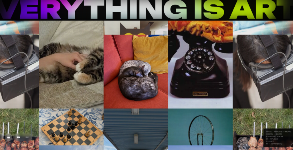
Everything Is Art is a project that turns your everyday life into a modern art manifesto. Upload a photo and receive a sharp and pretentious description in the style of an art critic from Tate Modern.
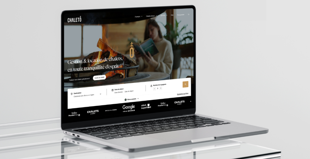
A high-performance, conversion-focused website built for Chaletô, a short-term rental management company trusted by 200+ properties. Designed to increase bookings and streamline operations, the platform delivers a fast, intuitive experience for both travelers and property owners while maximizing revenue while reducing administrative workload.
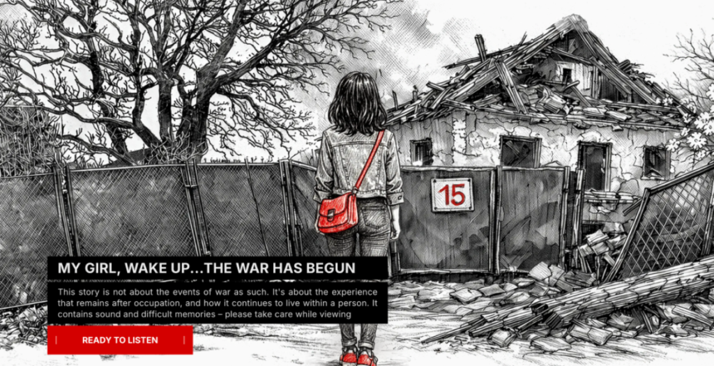
Ukrainska 15 is an interactive long-read that tells a personal story about the first days of the war in Ukraine. The project documents everyday moments, memories, and emotional experiences that often remain outside official narratives.
The website combines storytelling, illustration, and scroll-based interaction to recreate the atmosphere of uncertainty, fear, and resilience people experienced during that time. The narrative moves from darkness to light, symbolizing the journey from the basement during shelling to life continuing above ground.
Through a minimal visual language the project focuses on memory, trauma, and the human side of war. Ukrainska 15 is both a personal archive and a digital story about how ordinary life changes in extraordinary circumstances.
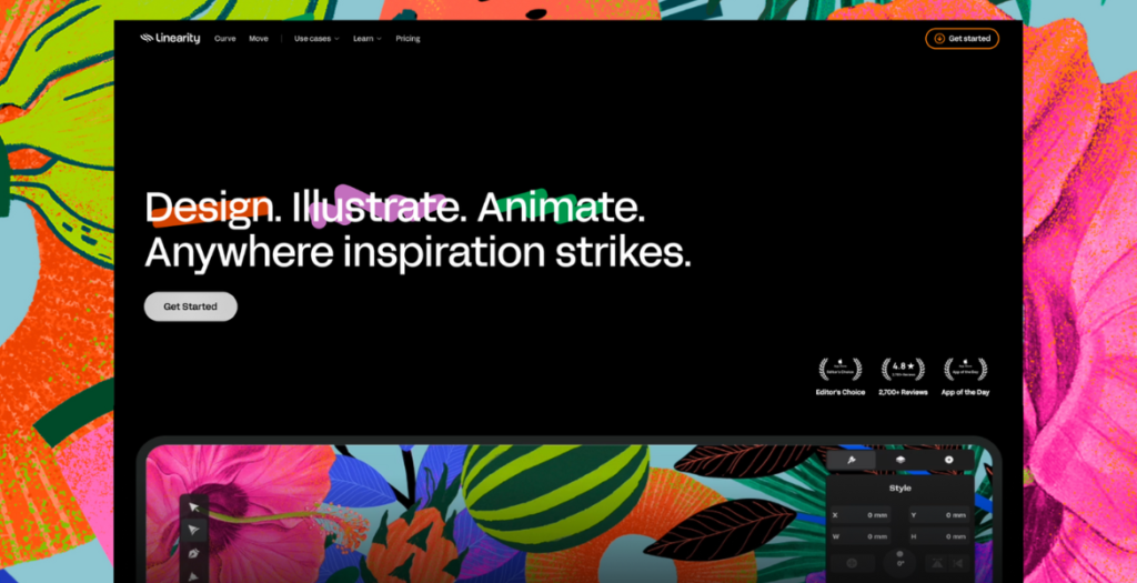
A redesign for Linearity’s website, shifting away from a marketing-led B2B approach to speak directly to illustrators, designers, and motion creators using Curve and Move.
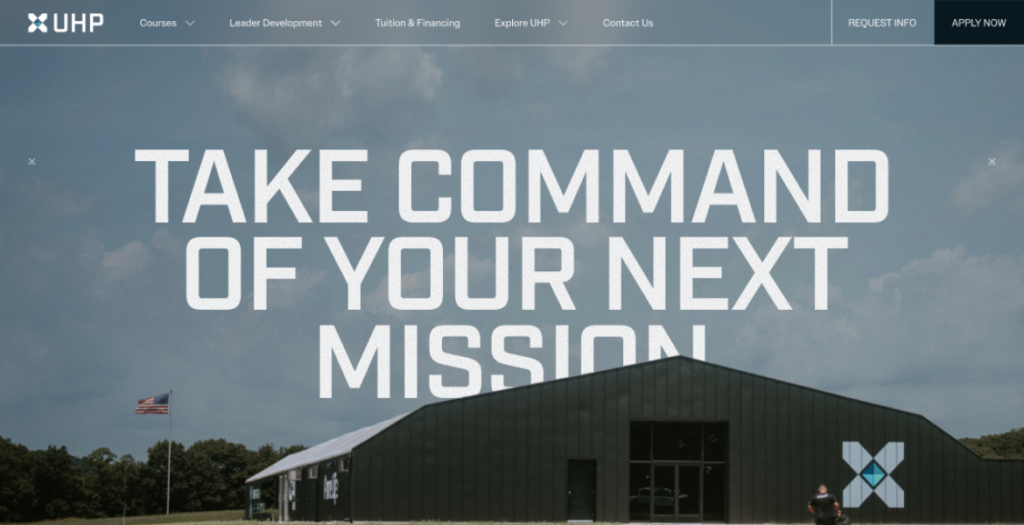
This project reimagined UHP’s website as a transformation engine, not just an information hub. Our goal was to translate UHP’s values — trust, resilience, and growth into a digital experience veterans could instantly relate to and feel confident navigating.
By restructuring the sitemap, refining messaging, and introducing a calm yet powerful visual language, we created a site that feels structured, human, and motivating. Optimized performance (90+ speed scores) and a conversion-driven UX helped UHP reach more veterans and scale its mission.
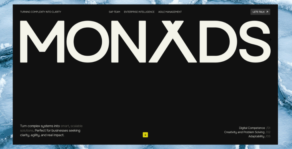
We partnered with Monads to turn a growing consulting firm into a confident digital brand. Through strategy, UX, and a motion-led interface, we translated complex SAP and transformation expertise into a clear, human, and conversion-driven website. Every interaction was intentionally designed to mirror how Monads thinks and works — structured, adaptive, and precise. The result is an award-winning platform that aligns brand, marketing, and sales, strengthens credibility with enterprise clients, and positions Monads as a modern consulting authority.
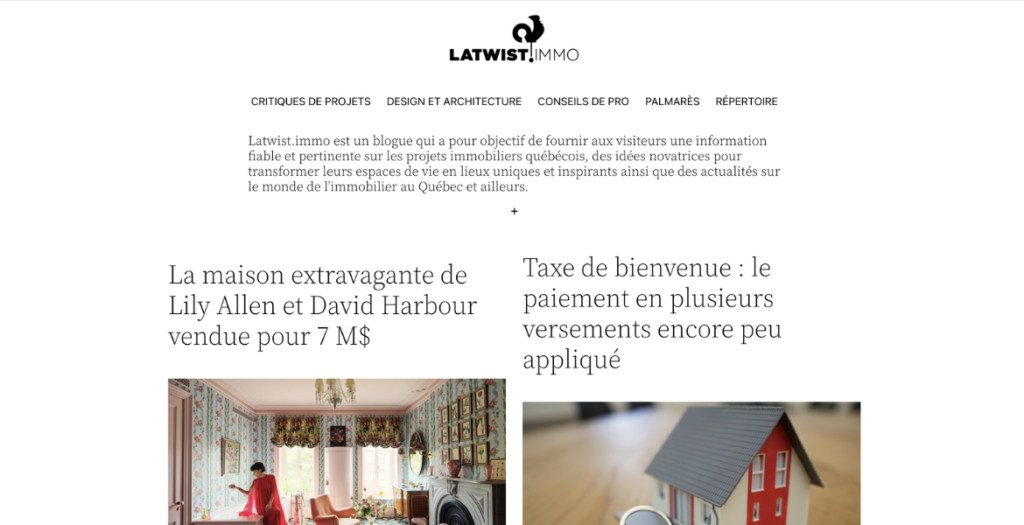
LaTwist.immo is an editorial blog dedicated to delivering reliable and relevant insights on Québec real estate projects. The platform blends market coverage with creative perspectives, offering innovative ideas to help readers transform their living spaces into distinctive, inspiring environments. Through curated articles and industry updates from Québec and beyond, LaTwist.immo positions itself as a trusted source for informed, design-forward real estate content.
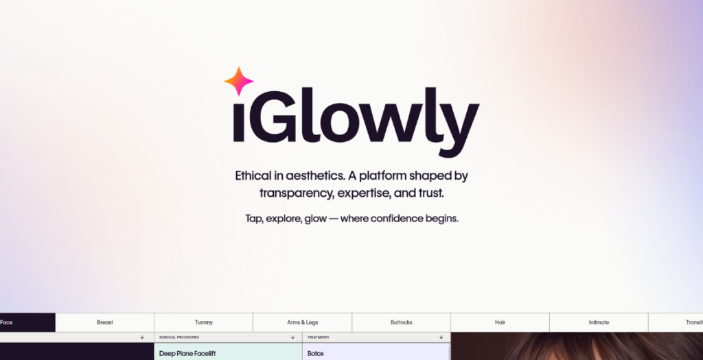
iGlowly is a Belgian platform designed to bring clarity, structure and transparency to aesthetic medicine. The interface blends minimalist design with a strong UX focus, offering patients clear multilingual guides (FR/NL/EN), independent editorial insights, and access to verified clinics and surgeons. The platform emphasizes ethical presentation, structured data, and seamless navigation across treatments, procedures, local search pages, and evidence-based insights — improving decision-making for patients while elevating the digital presence of aesthetic professionals.
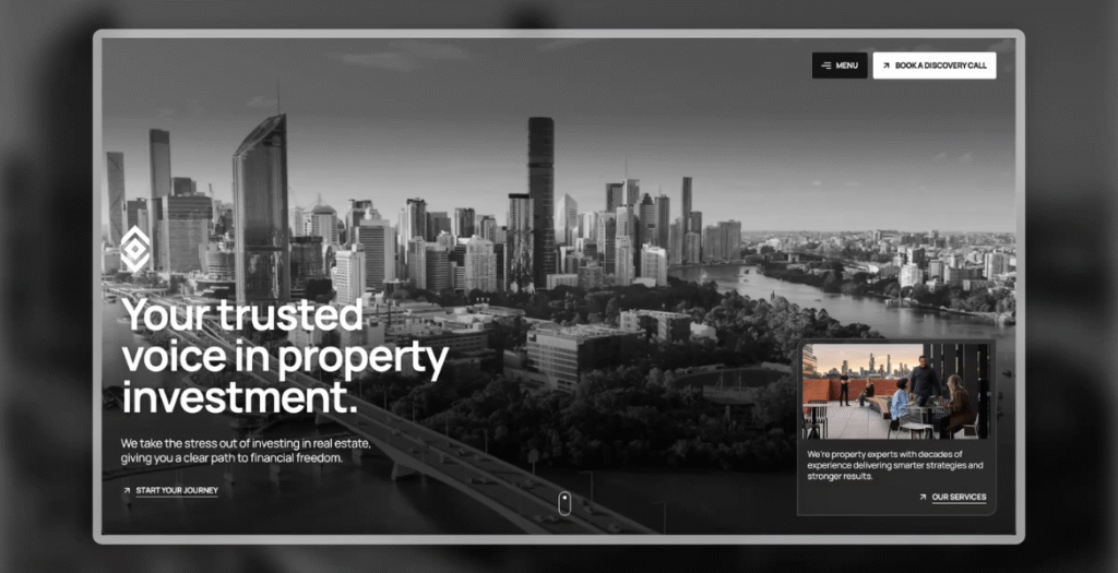
A strategic website redesign for Somerstone Property Group – evolving a founder-led business into a trusted collective to build wealth with confidence.
We use cookies to ensure that we give you the best experience on our website. If you continue to use this site we will assume that you are happy with it.