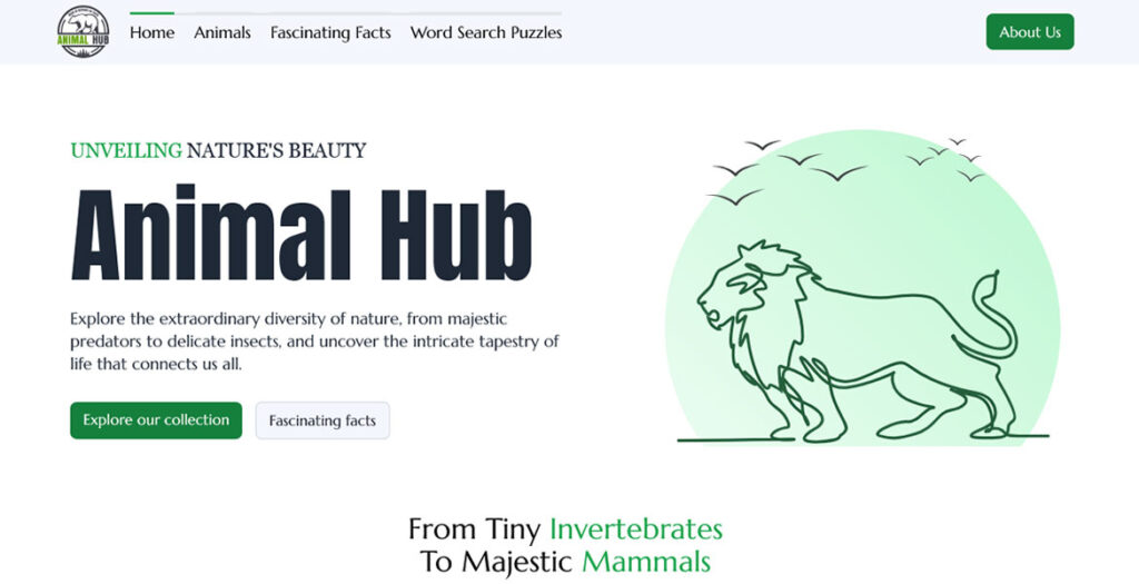
A redesign for Linearity’s website, shifting away from a marketing-led B2B approach to speak directly to illustrators, designers, and motion creators using Curve and Move.
This project reimagined UHP’s website as a transformation engine, not just an information hub. Our goal was to translate UHP’s values — trust, resilience, and growth into a digital experience veterans could instantly relate to and feel confident navigating.
By restructuring the sitemap, refining messaging, and introducing a calm yet powerful visual language, we created a site that feels structured, human, and motivating. Optimized performance (90+ speed scores) and a conversion-driven UX helped UHP reach more veterans and scale its mission.
We partnered with Monads to turn a growing consulting firm into a confident digital brand. Through strategy, UX, and a motion-led interface, we translated complex SAP and transformation expertise into a clear, human, and conversion-driven website. Every interaction was intentionally designed to mirror how Monads thinks and works — structured, adaptive, and precise. The result is an award-winning platform that aligns brand, marketing, and sales, strengthens credibility with enterprise clients, and positions Monads as a modern consulting authority.
LaTwist.immo is an editorial blog dedicated to delivering reliable and relevant insights on Québec real estate projects. The platform blends market coverage with creative perspectives, offering innovative ideas to help readers transform their living spaces into distinctive, inspiring environments. Through curated articles and industry updates from Québec and beyond, LaTwist.immo positions itself as a trusted source for informed, design-forward real estate content.
iGlowly is a Belgian platform designed to bring clarity, structure and transparency to aesthetic medicine. The interface blends minimalist design with a strong UX focus, offering patients clear multilingual guides (FR/NL/EN), independent editorial insights, and access to verified clinics and surgeons. The platform emphasizes ethical presentation, structured data, and seamless navigation across treatments, procedures, local search pages, and evidence-based insights — improving decision-making for patients while elevating the digital presence of aesthetic professionals.
A strategic website redesign for Somerstone Property Group – evolving a founder-led business into a trusted collective to build wealth with confidence.
Hey there✰! I’m Lydia Amaruch.
a senior ui/ux & brand Designer living it up in Berlin, where I spend my time turning ideas into stunning, impactful experiences. Basically, I make things look GREAT and work even better.
Looks Like Good Design is a curated design inspiration library built for people who care about their craft. Clean layouts, fast browsing, subtle motion, and short editorial notes that explain why a project works.
Getyepp.co.uk is a sharp SaaS showcase site I built using the Astro parchitecture for lightning-fast performance, with GSAP micro-animations that make the software feel alive without overdoing it.
The old site was doing their cutting-edge product a disservice—seriously outdated and clunky—so this was about giving it a professional, modern face that actually matches their tech. The animations highlight key features and user flows smoothly, pulling visitors into demos and sign-up paths while keeping everything clear and conversion-focused. It now looks (and performs) like the sophisticated SaaS platform it really is.
We use cookies to ensure that we give you the best experience on our website. If you continue to use this site we will assume that you are happy with it.