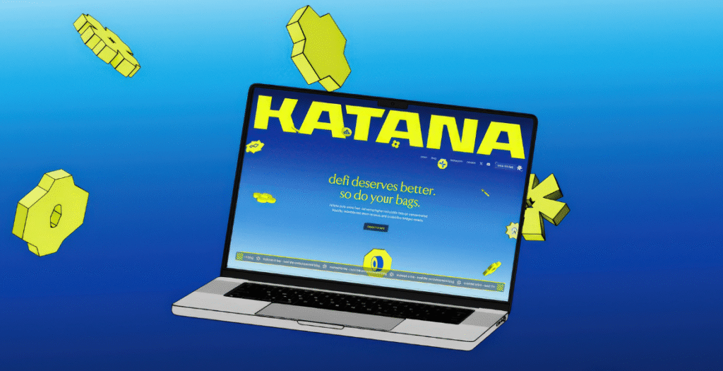
A decentralized finance platform transformed into a living digital world. Katana set out to turn idle capital into productive capital with a samurai-inspired identity that emphasizes loyalty and community. ROCANI built Katana’s world with sharp gradients, immersive motion, and playful gamification. The launch site unfolds like a journey through flowing capital, while 3D animations and an interactive gacha machine make complex mechanics intuitive and turn deposits into a shared, engaging experience.
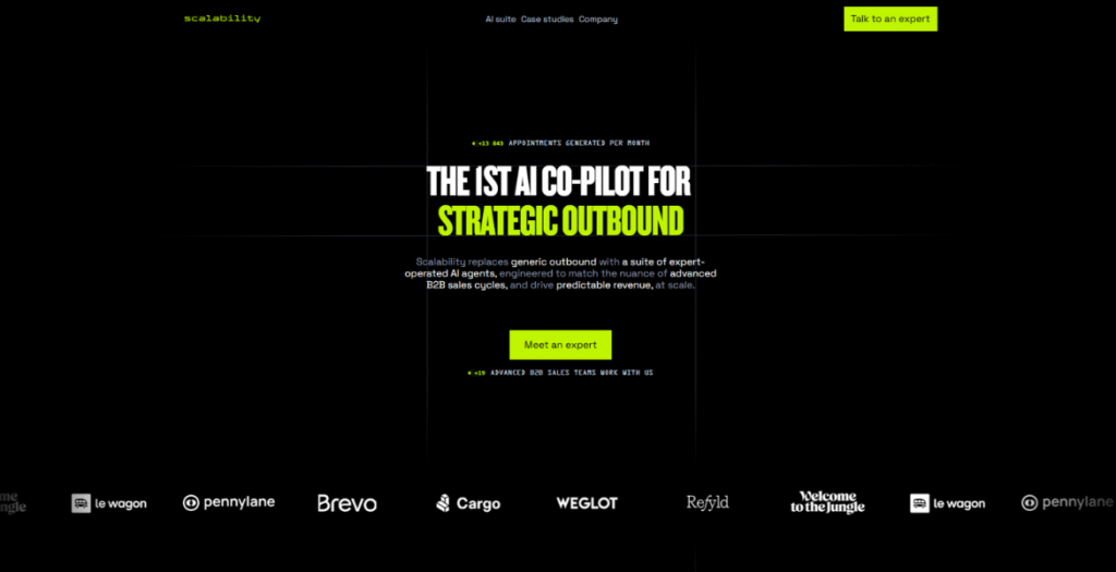
This B2B prospecting platform showcases a powerful visual narrative through smooth micro-interactions, scroll-triggered animations, and dynamic content reveals that guide visitors through Scalability’s value proposition. The design employs a clean, contemporary aesthetic with bold typography and a carefully curated color palette that reinforces trust and innovation.
The copywriting is razor-sharp, immediately communicating the platform’s core promise: “Contact the right person, at the right company, at the right time, with the right approach.” Each section is pedagogically structured to educate prospects about sourcing, identifying, enriching, and contacting decision-makers across 1M+ companies.
Key design highlights include animated data visualizations, interactive feature showcases, and seamless transitions that make complex B2B processes feel accessible and engaging. The site’s architecture balances aesthetic appeal with conversion optimization, featuring strategic CTAs and social proof elements like “24 meetings generated per month.”
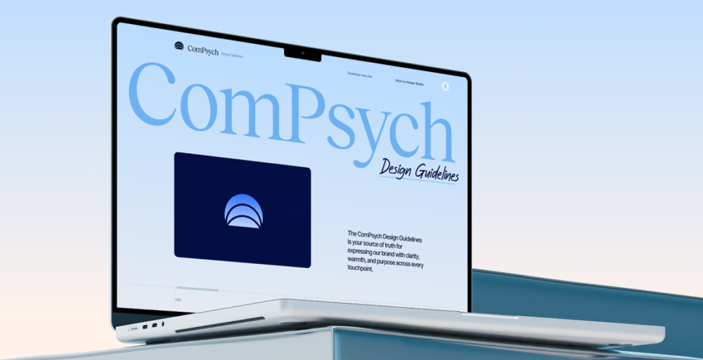
ComPsych is the world’s largest provider of employee assistance programs (EAP), and supports over 130 million people in more than 190 countries. They came to us to reimagine their 40 year old brand and redefine their strategy and visual identity. They were pretty old-school and they had a lot of new fancy startups with cool branding gnawing at their heels, so the goal was to help them solidify their position as the actual market leader.
We took the time (outside our scope with them) to put together a brand website that consolidates this new direction.
Edtech wanted to build an all-in-one cloud learning management system where knowledge is shared in an accessible and interactive approach due to a sleek design and minimalistic layout.
We redesigned the website for the Sacramento Regional Transit District. The website is designed to help travelers in Sacramento find the best ways to commute throughout the city using public transit system. We did a complete redesign of their website that included :
– Strict adherence to the brand style guide
– Animated hero image
– A real time trip planner custom widget, that matched their brand colors, icons and gave step by step details of a route to take from place A to place B
– A News section with up-to-date information and PR
– A Schedules calendar
– Real time Alerts about transit delays and weather alerts
– A Lot More
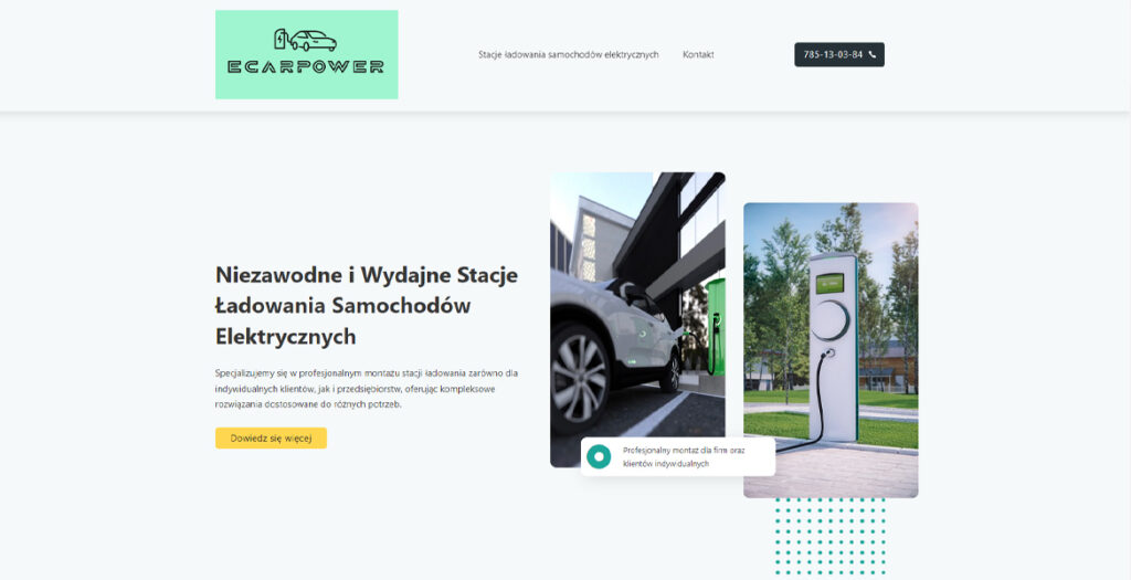
Introducing “ECARPOWER” – your premier destination for cutting-edge electric vehicle charging solutions in Poland. Our website showcases a sleek and user-friendly design, mirroring the efficiency of our charging stations. Immerse yourself in a virtual tour of our state-of-the-art facilities, strategically located across the country for your convenience.
Therapy Warsaw presents a thoughtfully designed digital presence for a psychotherapy practice serving Warsaw’s international community since 2007. The website exemplifies how sensitive healthcare services can be communicated through clean, accessible design that prioritizes user trust and emotional safety.
The site features a minimalist aesthetic with careful typography and generous white space that creates a calming, professional atmosphere appropriate for mental health services. The information architecture is intuitively structured, guiding visitors through essential sections: individual therapy, couples counseling, consultation process, therapeutic approach, and practitioner profiles.
Key design strengths include:
• Thoughtful Content Hierarchy: Clear navigation between services (individual/couples therapy), methodology, and practical information
• Culturally Sensitive Design: Bilingual functionality serving both English and Polish speakers, with special attention to international community needs
• Trust-Building Elements: Transparent presentation of therapist credentials, methodologies (Process Oriented Psychology, psychodynamic approaches), and professional affiliations
• User-Centered Journey: Logical flow from initial consultation information to service details, respecting the sensitive nature of seeking psychological support
• Accessibility Focus: Clean typography and straightforward navigation that doesn’t overwhelm visitors who may be experiencing distress
The website successfully balances professional credibility with approachability, using design to reduce barriers for those seeking mental health support. It demonstrates how healthcare websites can maintain clinical professionalism while creating an inviting digital environment that reflects the practice’s therapeutic philosophy of careful exploration and understanding.
A refined portfolio and service site of Mirage Studio – an interior design atelier based in Warsaw, Poland. The page blends clean typography, soft animations, and structured grid layouts to present residential and commercial interiors with elegance and clarity. Built for intuitive navigation and high usability, the site reflects the studio’s minimalist yet expressive design approach. Responsive, SEO-optimized, and rich in custom visuals, it showcases contemporary interior architecture tailored to urban living.
We use cookies to ensure that we give you the best experience on our website. If you continue to use this site we will assume that you are happy with it.