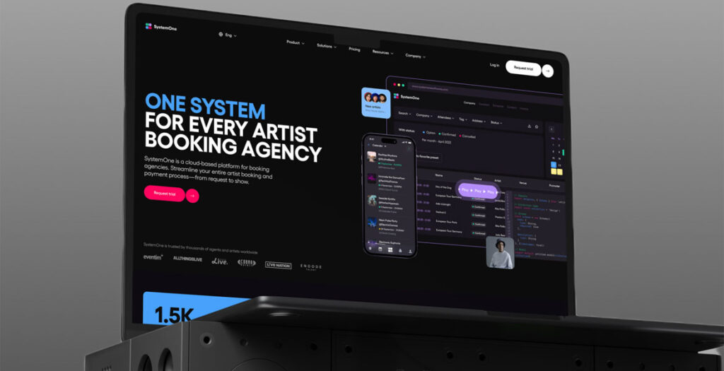
A fun and interactive website for SystemOne, a cloud-based platform for artist booking agencies to streamline their entire process—from request to show.
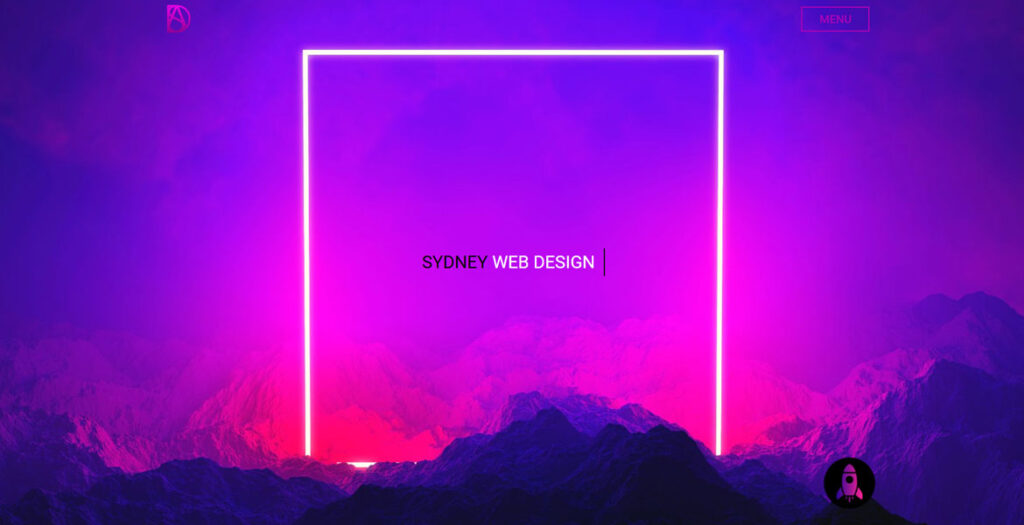
Sydney Digital Agency is a result-oriented digital marketing and web design and development agency that helps businesses improve their online presence. We are an agency of tech-oriented specialists and digital marketers who can help you focus your global web presence and strategy. As we are a boutique agency, the founders personally manage every client’s account, ensuring clear communication and rapid response to the client’s changing needs or shifts within marketplace dynamics. With years of expertise in web design and web development, we offer high-quality custom-built design and development solutions. We pride ourselves on excellent customer service and responsiveness. All our digital marketing solutions are bespoke creations that we deliver on time after a detailed evaluation of our client’s business situation and goals. We have provided digital solutions to over 100 clients in Australia, including National Printing Services brands, National Geographic, Engraving services, Schools, NDIS services providers, Hospitality, Fashion E-commerce, Beauty and cosmetic Australian brands and many others. Not sure what type of digital solutions you need? Contact us now!
Don’t board me connects pet owners with a team of experienced and passionate animal lovers, ensuring that the highest level of care is provided to your furry family member.
Bureau Capcap is a multi-cap creative studio based in the south of France. We put our many talents to work to help our customers with their creative and digital issues.
Interactive website for $Rfd Refund, one of the most promising crypto projects in the blockchain space.
The entry page starts with a preloader and an invitation to begin the journey by jumping down the rabbit hole. Users land on the main page and begin to gradually immerse themselves in the website’s experience. As they navigate through the pages, they follow the white rabbit, uncover hidden messages, and delve deeper into the intriguing world of Refund.
Smooth animations and effects are activated when scrolling or interacting with page elements, creating a deeply immersive experience.
Certain text or images appear or move as the user turns the page, creating a sense of dynamism and engagement. Built-in 13 cryptographic messages that appear on scrolling add an element of mystery and interactivity. This encourages the user to delve deeper into the content and creates a sense of participation in something exclusive. The use of contrasting colors and graphic effects adds a sense of depth. Some design elements look like an AR effect, creating the impression of a three-dimensional space. The sound effects enrich the emotional response from visiting the site.
After 28 years of leading Bangladesh’s real estate industry, Navana Real Estate has rebranded its identity.
We’ve redesigned their website to reflect this transformation, with every design choice complementing their new logo and tagline, symbolizing their diverse projects, innovative promise, and overall evolution.
By creating a cohesive design system that incorporates unique brand elements, colors, components, interactions, and typography, we’ve crafted a memorable visual identity. Additionally, we’ve enhanced navigation, filters, and search functionality to ensure the website is not only aesthetically pleasing but also highly functional for users.
We use cookies to ensure that we give you the best experience on our website. If you continue to use this site we will assume that you are happy with it.