Yellow

MYCIE ELEWACJI

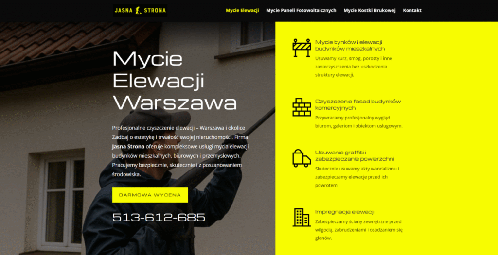
Jasna Strona: Elevating Warsaw’s Beauty, One Facade at a Time.
Welcome to Jasna Strona, Warsaw’s premier professional facade cleaning company. In a city where history meets modern ambition, we believe every building deserves to present its best face to the world. We are the trusted partner for homeowners, property managers, and businesses, dedicated to restoring the brilliance and preserving the integrity of your most valuable assets.

Our Promise: Uncompromising Quality & Eco-Conscious Care

We don’t just wash buildings; we rejuvenate them. Our comprehensive services are tailored to the unique character of each structure:

Expert Facade Cleaning: Specialized care for glass, brick, stone, plaster, and composite panels.

Safe & Efficient Methods: Utilizing advanced pressure washing, steam cleaning, and eco-friendly, biodegradable detergents that are tough on grime but gentle on the environment.

Rope Access Expertise: Our certified technicians perform high-rise cleaning safely and effectively without the need for expensive scaffolding, minimizing disruption.

Why Property Managers and Homeowners Choose Us:

Curb Appeal Restored: Instantly enhance the aesthetic and market value of your property.

Long-Term Protection: Remove harmful contaminants like mold, algae, and pollution that can cause decay.

Reliability & Professionalism: From the first transparent quote to the final walk-through, we deliver on our promises with clear communication and punctuality.

A Sustainable Choice: Our commitment to green cleaning solutions ensures a safer environment for tenants, pedestrians, and local ecosystems.

Ready for a Spotless Transformation?

Your building’s brightest side is waiting to be revealed. Explore our services, see our stunning before-and-after gallery, and request your free, no-obligation quote today.

Jasna Strona – Professional Facade Cleaning in Warsaw. Where Pristine Results Meet Peace of Mind.


10/14/25
365

MYCIE ELEWACJI by NETNAJEM  

Gorilla Science

Inspired by retro-futurism, Gorilla Science have gone bananas by combining their love for educational science with the animation and art of early 20th century sci-fi. Their engaging and vibrant brand identity has brought their unconventional website to life.

09/24/25
365

Gorilla Science by CreativeWeb  

Perico Energy Drinks

Perico Drinks was founded with one mission: to bring bold, refreshing energy to the world of beverages while staying true to quality, taste, and design. Built on the idea that energy shouldn’t come at the cost of health or flavor, Perico blends vibrant, natural ingredients with modern branding to deliver a drink that stands out in both taste and lifestyle appeal.

09/14/25
375

Perico Energy Drinks by Silv Studio  

Think Falklands

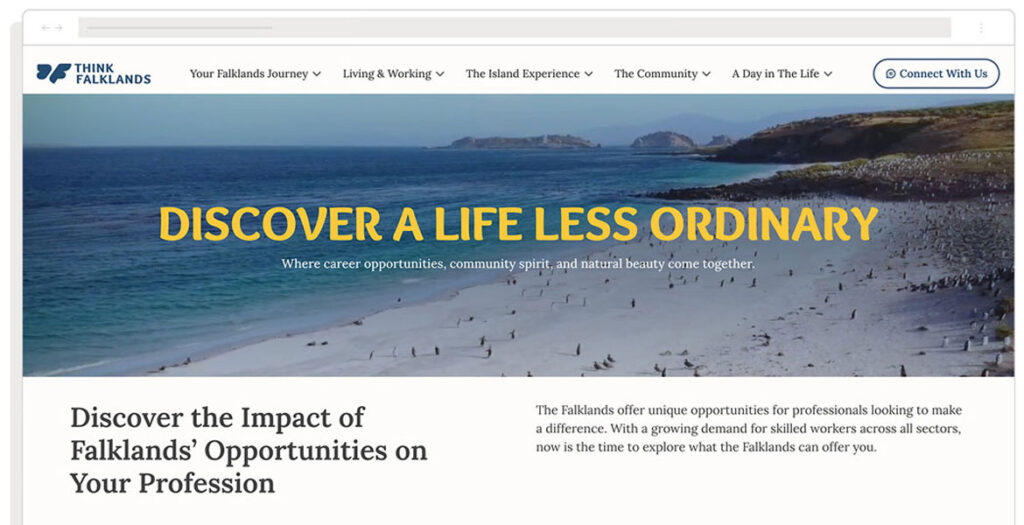
ThinkFalklands.com is the official relocation and lifestyle portal for the Falkland Islands, designed to attract skilled workers, professionals, and their families to consider the islands as a place to live and work. The site provides practical guidance on relocation, showcasing opportunities in healthcare, education, engineering, and other vital sectors. It also highlights the unique lifestyle of the islands, from community spirit and family life to outdoor adventures, wildlife, and culture. Visitors can explore “A Day in the Life” stories, discover career opportunities, and learn about housing, schooling, and healthcare. ThinkFalklands.com acts as both an informative resource and an inspiration, helping prospective residents imagine their future in the Falklands while offering clear, accessible steps for making the move and integrating into island life.

09/09/25
315

Think Falklands by Browser London  

Mini-MBA for Designers and Creatives

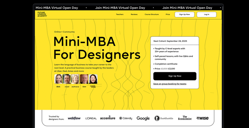
The Mini-MBA for Designers & Creatives website by Future London Academy bridges the gap between design and business. Yellow leads the identity as our central brand colour — bright, confident, and unmistakably energetic — supported by a high-contrast palette that keeps momentum across pages. An interactive hero animation visualises the programme’s promise: designers can connect craft to commercial impact — and make it spark. Throughout the system, linework blends business graph language with design curves; dots double as data points and the “handles” of Bézier paths, symbolising control, iteration, measurable outcomes but also fun and creativity.

08/30/25
375

Mini-MBA for Designers and Creatives by Future London Academy / Uliana Kovalenko  

ComPsych Brand Hub

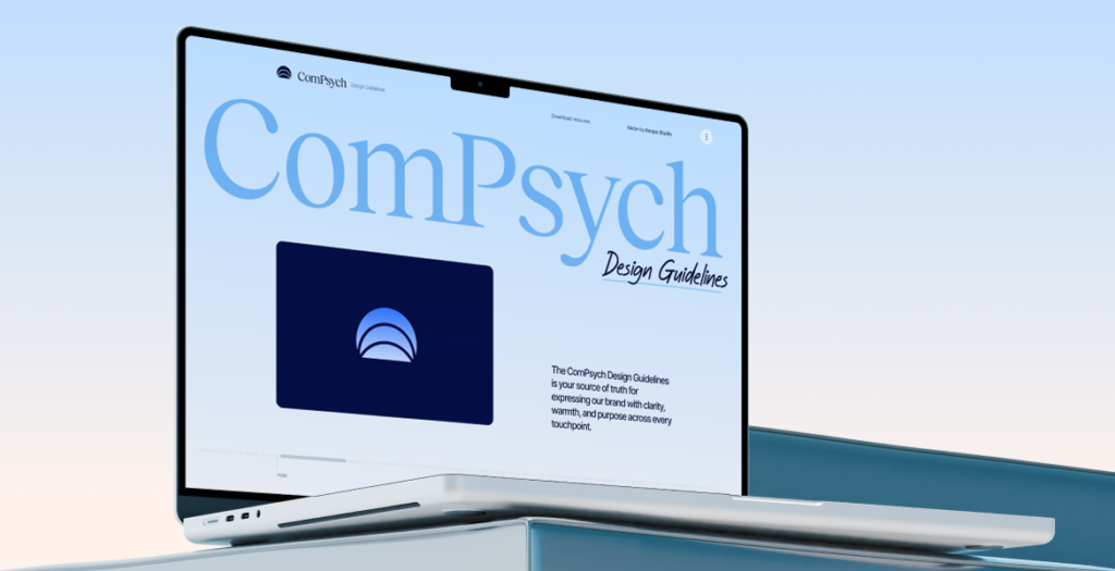
ComPsych is the world’s largest provider of employee assistance programs (EAP), and supports over 130 million people in more than 190 countries. They came to us to reimagine their 40 year old brand and redefine their strategy and visual identity. They were pretty old-school and they had a lot of new fancy startups with cool branding gnawing at their heels, so the goal was to help them solidify their position as the actual market leader.

We took the time (outside our scope with them) to put together a brand website that consolidates this new direction.

08/23/25
375

ComPsych Brand Hub by Konpo  

JCM

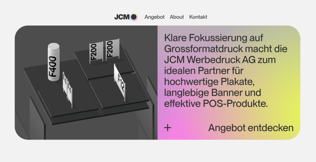
JCM is a leading provider of large-format printing in Europe.

08/21/25
380

JCM by KiloKilo  

Sacramento Regional Transit District

We redesigned the website for the Sacramento Regional Transit District. The website is designed to help travelers in Sacramento find the best ways to commute throughout the city using public transit system. We did a complete redesign of their website that included :
– Strict adherence to the brand style guide
– Animated hero image
– A real time trip planner custom widget, that matched their brand colors, icons and gave step by step details of a route to take from place A to place B
– A News section with up-to-date information and PR
– A Schedules calendar
– Real time Alerts about transit delays and weather alerts
– A Lot More

08/16/25
592

PORTMAN NIERUCHOMOŚCI

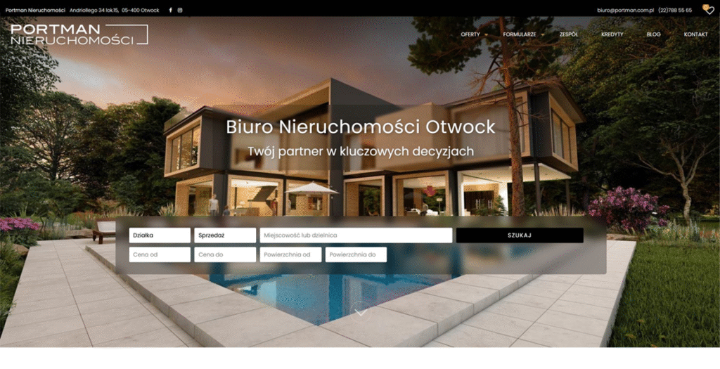
Portman is the online face of a dynamic real‑estate agency based in Otwock, Poland. The site instantly captures attention with a clean, modern layout that balances vibrant color accents with generous white space, creating a welcoming atmosphere for both buyers and sellers. Every visual element feels purposeful, turning the browsing experience into a seamless journey through Otwock’s property market.

Design & Visuals
The visual language is bold yet refined. A palette of bright blues, warm oranges, and subtle greys punctuates the interface, guiding the eye toward key calls‑to‑action and property highlights. High‑resolution photographs dominate the homepage, arranged in a responsive grid that adapts fluidly from desktop to mobile. Hover effects and subtle animations give each image a tactile feel, encouraging users to explore listings in depth.

User‑Centred Navigation
Navigation is intuitive: a sticky top bar houses the main menu—Home, Listings, About, Services, Blog, and Contact—while a secondary “quick‑search” bar lets visitors filter properties by type, price, and location without leaving the page. Breadcrumbs and clear pagination keep users oriented, and a sticky “Back to Top” button ensures effortless scrolling through image‑heavy sections.

WordPress Foundations
Built on WordPress, the site leverages a custom‑crafted theme that blends performance with flexibility. Advanced Custom Fields (ACF) power the property listings, allowing agents to input detailed specifications, floor plans, and multimedia galleries. The integration of the Elementor page builder provides a drag‑and‑drop workflow for future content updates, while Yoast SEO and WP Rocket keep the site fast, searchable, and secure.

Rich Content & Engagement
Beyond listings, Portman offers a blog that shares market insights, neighborhood guides, and client success stories, all presented in a clean, typographically balanced layout. Social media icons are subtly placed in the footer, encouraging cross‑platform interaction. A contact form, Google Maps embed, and live chat widget round out the conversion toolkit, making it easy for prospects to get in touch instantly.

Overall Impact
Portman exemplifies how a real‑estate agency can combine a vibrant, image‑driven aesthetic with robust WordPress functionality. The result is a polished, user‑friendly portal that showcases properties beautifully while delivering the performance and scalability needed for a growing business. This site stands out as a compelling case study for clean, colorful web design done right.

08/07/25
259

PORTMAN NIERUCHOMOŚCI by NETNAJEM  

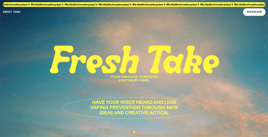
FreshTake

Chat, create, and make change. Across two workshops you’ll learn how to create content and build a campaign for impact.

07/09/25
365

FreshTake by Your Creative  

FlowFest 2025

The No.1 Fest for: Web Designers & Devs.

06/27/25
365

FlowFest 2025 by Dennis Snellenberg  

Cherry Arts

Showcasing the many capabilities of a local art-based non-profit through an in-depth website redesign and development project.

05/27/25
180

Cherry Arts by AOR Inc