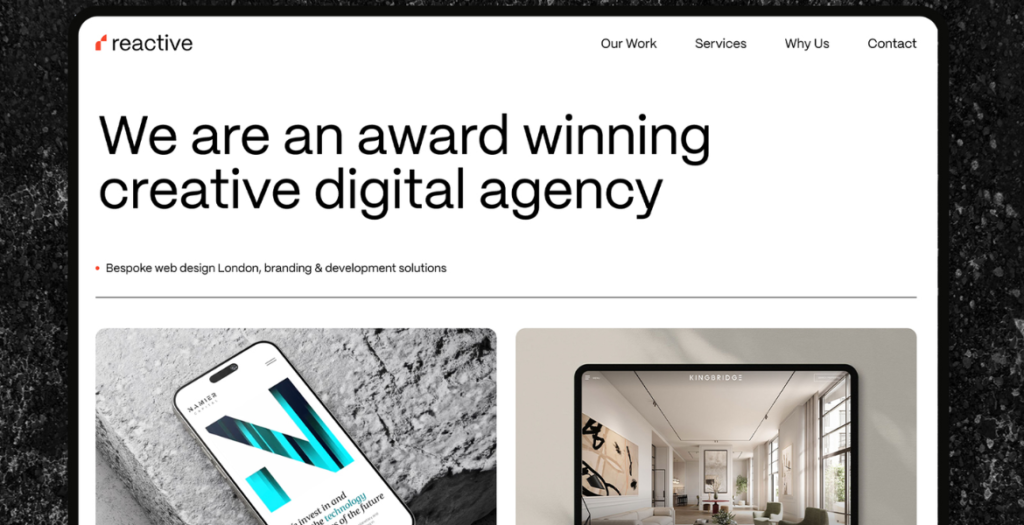
The Reactive website showcases a modern, design-led approach to web design and development in London. Built to reflect our focus on clean aesthetics, performance and user experience, the site highlights our work, process and capabilities in creating high-impact digital experiences for ambitious brands.
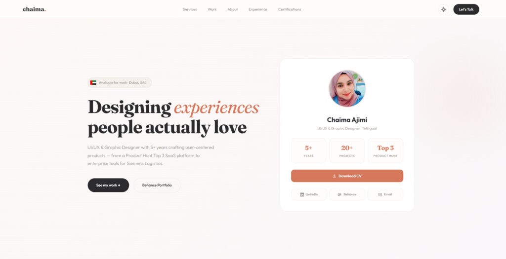
A modern UI/UX portfolio showcasing user-centered design projects across web and mobile platforms. The website focuses on clean layout, strong visual hierarchy, and usability, presenting case studies in a clear and structured way.
Built with a minimalist approach, the design emphasizes readability, responsive behavior, and smooth user experience, highlighting work in SaaS, fintech, and product design.
We use cookies to ensure that we give you the best experience on our website. If you continue to use this site we will assume that you are happy with it.