Fullscreen

FIVECELL

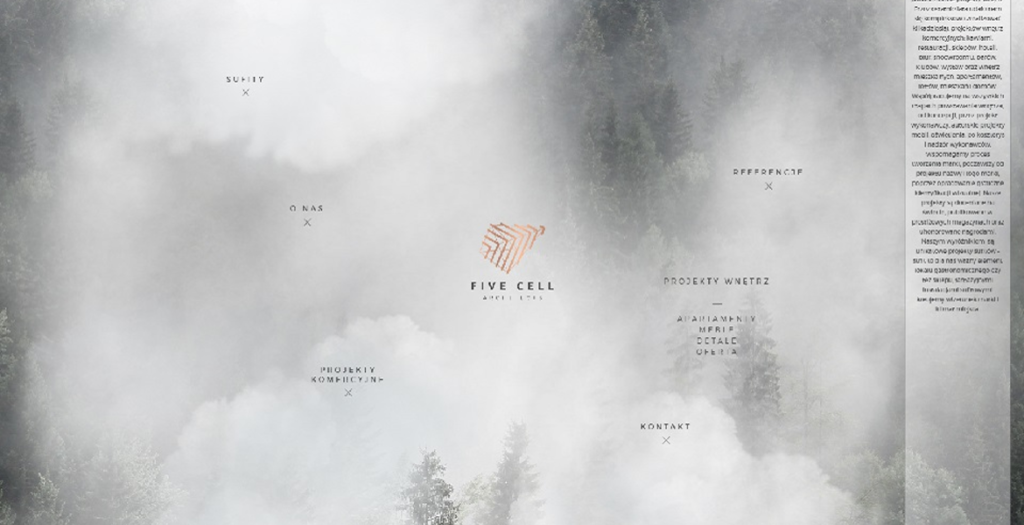
FIVECELL is a contemporary interior architecture and design studio creating distinctive residential and commercial spaces, from private homes and apartments to hospitality, retail and workplace interiors. The website was designed to reflect the studio’s approach to architecture and interior design, combining strong visual storytelling with a refined and highly considered digital experience.

Large-scale project photography takes centre stage, supported by an editorial-inspired layout, sophisticated typography, generous whitespace and a carefully structured grid. The restrained interface allows each project to speak for itself while subtle animations, smooth transitions and interactive elements add depth and movement to the browsing experience. Thoughtful navigation and clear content hierarchy make it easy to explore FIVECELL’s portfolio while maintaining a strong visual rhythm throughout the site.

The result is a minimalist yet expressive website that connects the studio’s physical design philosophy with its digital identity, presenting architecture, interiors, materials and details through a polished contemporary web experience.

09/27/26
6712

FIVECELL by FIVECELL  

Atomicdust.com

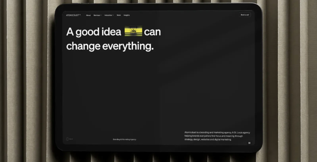
How does a website design agency launch a website for itself? For us, it took a lot of debate, innovation and precision.
We built a fully custom WordPress theme with motion and video throughout: big animated headlines, hover states and full-motion clips built from project imagery to guide (and keep) visitors’ attention. It’s all set on a Swiss grid, so even with the unexpected elements, tension from juxtaposition and motion, the experience stays digestible and orderly.
The power of the new site isn’t just aesthetics though. Twelve interactive tools invite visitors to get a free audit within seconds, reporting back on their brand, website accessibility, SEO, AI readiness and more. The tools drive leads and turn the site into an impressive experience for the audience. Finally, the site’s structure supports rapid iteration: custom landing pages, blog-to-portfolio conversions and social content can all spin up in minutes.

09/17/26
25375

Atomicdust.com by Atomicdust  

Enrich Aesthetics

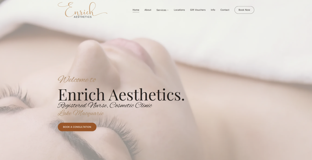
Enrich Aesthetics is a registered nurse cosmetic clinic in Lake Macquarie, NSW.

The design has to earn trust without testimonials or heavy before-and-after photos, because Australian advertising law rules both out.
So it leans on calm, near-white space, an Alex Brush script logotype and Playfair Display headings set against Inter body text.
Every heading fades in one letter at a time as you scroll, and Lenis smooth scrolling keeps the pace slow and considered. It is a fully custom Astro build styled with Tailwind CSS and animated with GSAP.

09/15/26
26861

Enrich Aesthetics by Newcastle Web Co  

Jealous Film

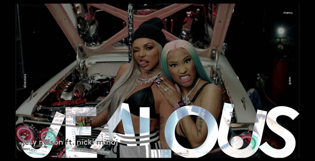
A creative production studio brought to life through movement. A cinematic digital experience where projects, directors and stories flow seamlessly into one immersive portfolio.

09/13/26
25442

Jealous Film by Studio This  

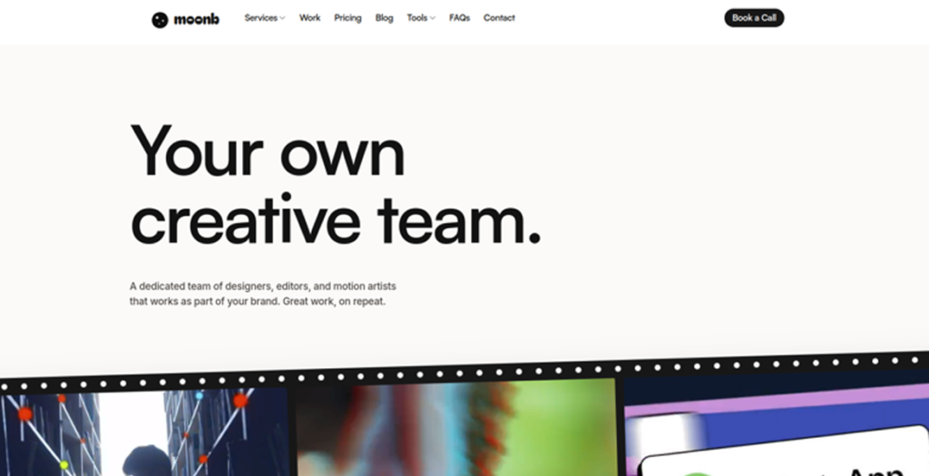
Moonb

A creative studio that gives companies a dedicated creative director and production team, working as an extension of their own. Video, motion, design, and animation, on an ongoing basis. New work, every week.

09/07/26
19958

Moonb by Moonb  

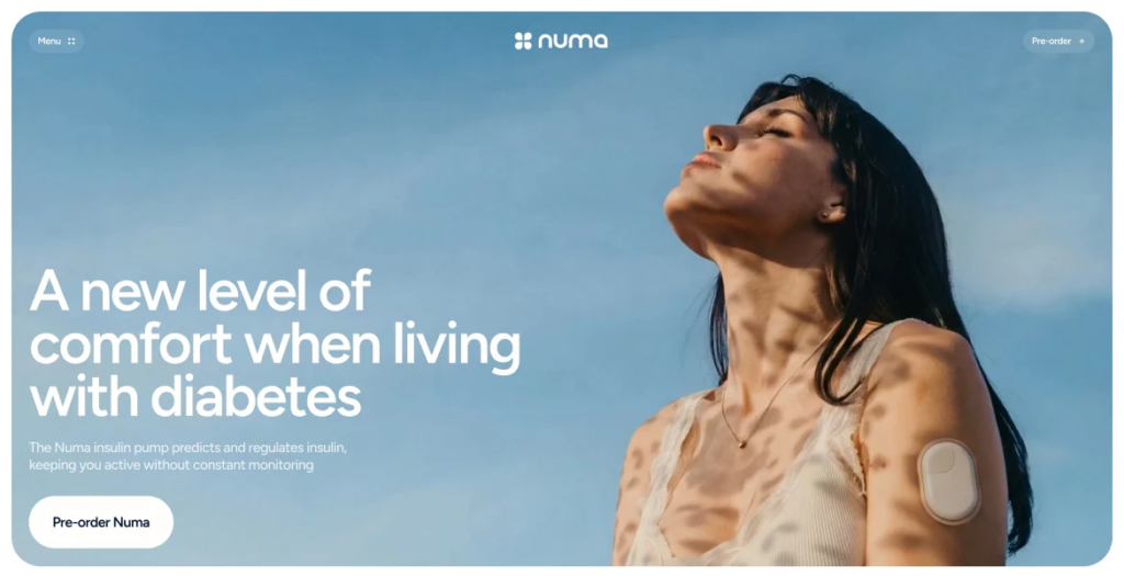
Numa

A smart insulin pump that helps people with diabetes control glucose more easily in their daily lives.

08/20/26
9156

Numa by UPROCK  

VANMOTION — Cars · Music · Clothing

VANMOTION is an independent creative platform from Madrid combining automotive culture, original music and clothing under one identity. The website blends cinematic imagery, motion, sound and responsive design to create an immersive digital experience built around real work, movement and character.

08/18/26
385

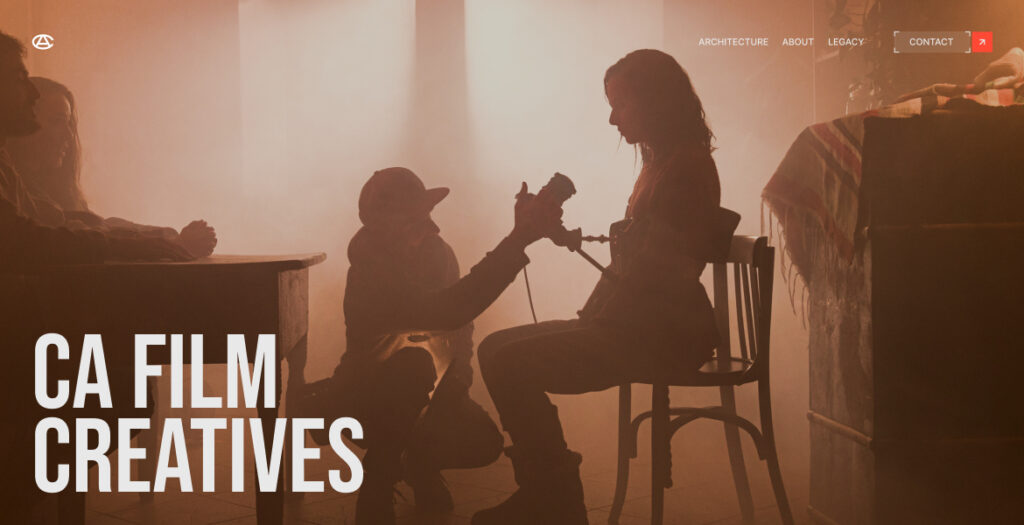
CA Film Creatives — Cinematic Studio

A cinematic journey into architectural filmmaking. Dark editorial design, immersive video storytelling, and bold typography for a production studio shaping luxury real estate campaigns.

08/01/26
406

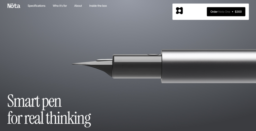
NŌTA | Smart Writing Infrastructure

Smart writing system combining a precision pen, intelligent paper, and real-time digital sync for modern thinking.

07/31/26
371

DIBJICK MediaPuls – Agency Website

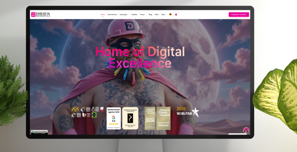
Our agency’s website with storytelling of Media Man and Polly Puls. When we developing and designing the website, we focused not only on a consistent design but, above all, on functionality, performance, and aesthetics. That’s why we used effects and animations only sparingly as highlights, so as not to overload the website visually or technically. The website is originally available only in German. It was temporarily translated into English for the award submission.

07/31/26
365

DIBJICK MediaPuls – Agency Website by DIBJICK MediaPuls GmbH  

Grawer Gift

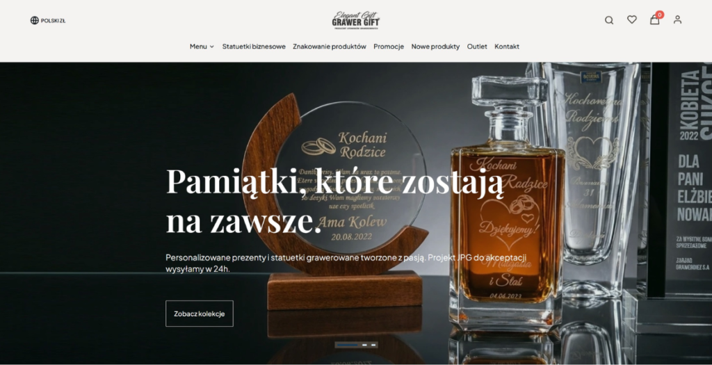
Grawer Gift showcases a completely redesigned e-commerce experience built on the Shoper platform. The new design focuses on elegance, simplicity, and usability, creating a premium shopping environment for personalized engraved gifts. A bright, minimalist interface combined with generous white space allows high-quality product photography to take center stage, while refined typography and subtle animations add a modern touch.

The redesigned navigation streamlines product discovery through clearly organized categories and intuitive filtering, making it easy to browse gifts for every occasion. Every element has been carefully crafted to improve the customer journey, from product exploration to checkout. Fully responsive and performance-optimized, the website delivers a seamless experience across desktop, tablet, and mobile devices.

By combining contemporary UI design with functional e-commerce architecture, the new Grawer Gift website creates an engaging, visually refined shopping experience that reflects the craftsmanship and personalization behind every product.

07/27/26
360

Grawer Gift by Best Designs  

Primo BHP

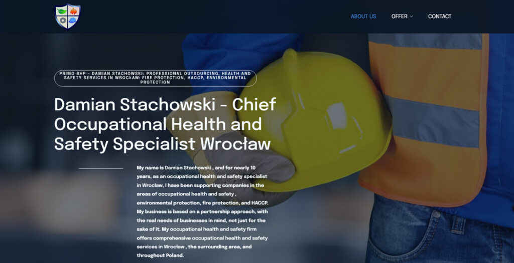
Primobhp is a modern website crafted for a specialist BHP (health and safety) company based in Wrocław, Poland. The design strikes a strong balance between professionalism and visual clarity, presenting complex services in an accessible and engaging way.

The layout is clean and highly functional, with a well-structured hierarchy that guides users effortlessly through the content. Generous spacing, clear typography, and a restrained color palette reinforce a sense of trust and reliability—key qualities for a safety-focused brand.

High-quality imagery plays an important role throughout the site, adding authenticity and visual interest without overwhelming the user. The images are thoughtfully integrated, supporting the content and enhancing the overall user experience.

Subtle interactions and smooth navigation contribute to a polished feel, while maintaining performance and usability across devices. The result is a refined, user-centered design that effectively communicates expertise and builds credibility.

Primobhp stands out as a strong example of how clean aesthetics and functional design can work together to create a professional and impactful web presence.


07/25/26
390

Primo BHP by Inbound Tom