Colorful

Grawer Gift

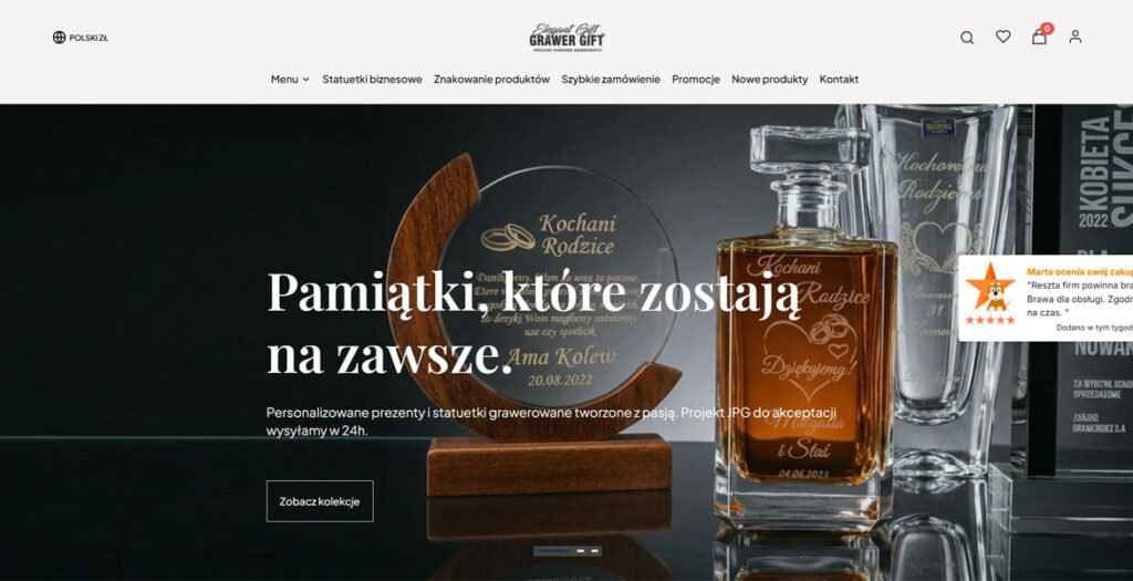
Grawer Gift presents a fresh and modern redesign built on the Shoper platform, combining premium aesthetics with a highly intuitive shopping experience. The new interface features a minimalist layout, refined typography, and a bright color palette that places strong emphasis on personalized engraved products. Large product photography and carefully balanced white space create a clean, elegant atmosphere throughout the site. Smooth hover animations and modern UI elements add subtle interactivity without distracting from usability. Navigation has been simplified for faster browsing, allowing users to easily explore categories, occasions, and custom gift options. The responsive design adapts seamlessly across desktop, tablet, and mobile devices, ensuring a consistent experience on every screen. Overall, the redesigned Grawer Gift website successfully blends contemporary e-commerce functionality with sophisticated visual presentation, creating an engaging and polished online shopping environment.

05/28/26
253

Grawer Gift by INBOUND  

Songo – Analysis for Hits

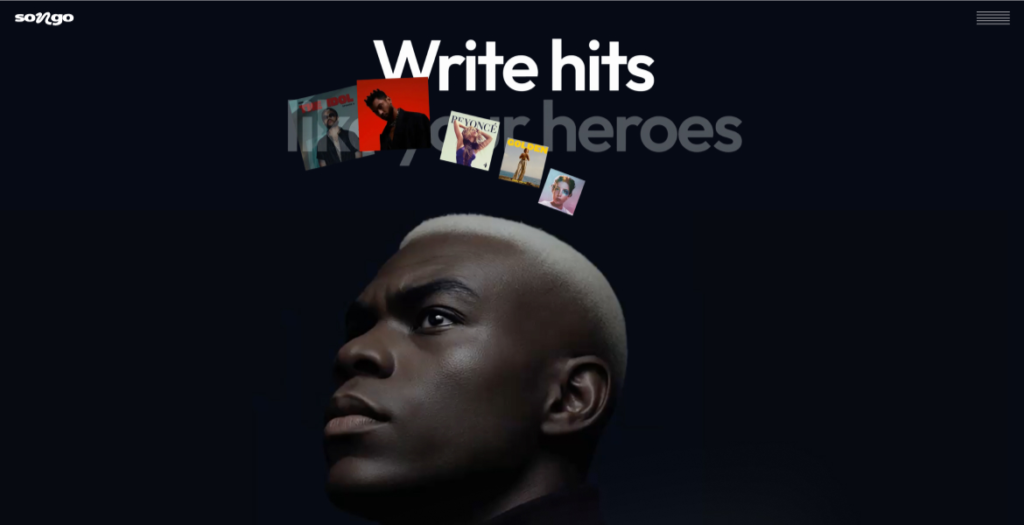
Discover how hit songs are made with Songo – the AI-powered tool for visual song analysis, structure, patterns, and pro-level songwriting insights. Upload, explore, create.

05/18/26
385

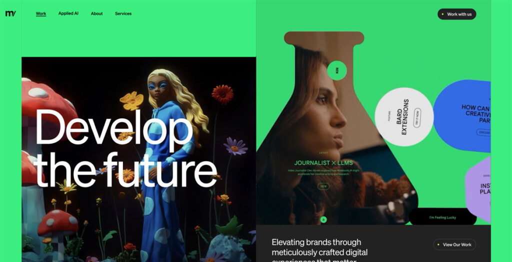
Metajive

Metajive redesigned its website to create a more intentional, editorially driven digital presence that better reflects the depth of the studio’s creative, technology, and AI capabilities. The new experience brings greater clarity, rhythm, and sophistication to how the brand and its work are presented, pairing visual restraint with thoughtful motion and a more disciplined content structure. The result is a polished, contemporary platform that feels both elevated and highly functional.

04/19/26
365

Metajive by Metajive  

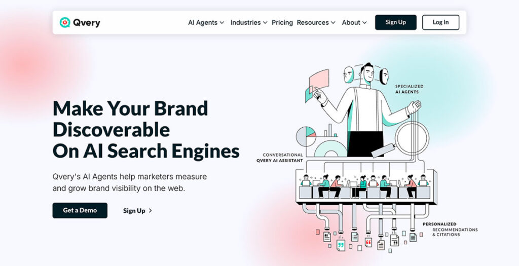
Qvery

Qvery builds AI agents that measure and grow brand visibility in ChatGPT and Google AI Mode. Built for marketers who want to know what AI search engines say about their brand.

04/12/26
150

Qvery by Qvery  

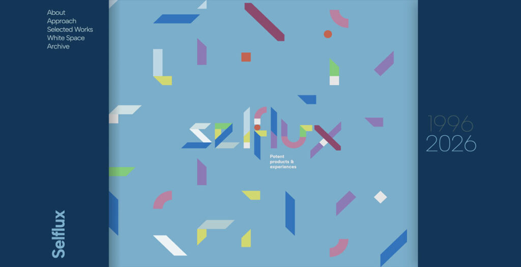
Selflux – Nick Cristea

Archive and Portfolio covering over 30 years of digital products and experiences from Interaction Designer Nick Cristea

04/03/26
371

Selflux – Nick Cristea by Nick Cristea  

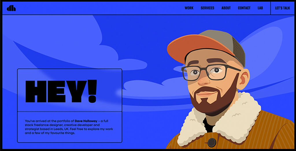
Dave Holloway – Freelance Portfolio

Portfolio website of Dave Holloway – an award-winning Freelance Designer, Creative Developer and Strategist working globally from Leeds, UK.

03/30/26
375

Wizardly

Wizardly is a creative agency specializing in biotech, medtech, life sciences, and software. Based in Charleston, SC, we partner with fast-moving companies to build brands, websites, and design systems that hold up under the scrutiny of investors, scientists, and enterprise buyers.

03/26/26
375

Wizardly by Wizardly  

FINCORP

FINCORP is a Warsaw-based accounting firm that presents its services through a refined and thoughtfully crafted website design. The overall aesthetic is clean, modern, and highly functional, reflecting the precision and reliability expected from a financial services provider. From the first interaction, users are welcomed with a structured layout that prioritizes clarity, allowing them to quickly understand the scope of services and navigate the site with ease.

The design relies on a balanced use of whitespace, which enhances readability and creates a sense of order and professionalism. Typography is carefully selected to ensure legibility across all devices, while consistent spacing and alignment reinforce a cohesive visual identity. The color palette remains subtle and business-oriented, supporting the brand’s credibility without distracting from the content.

Imagery plays an important role in the overall experience. High-quality photos are integrated seamlessly into the layout, adding a human touch to the otherwise technical nature of accounting services. These visuals help build trust while maintaining a polished and corporate feel.

Functionality is at the core of the design. Key sections such as services, company information, and contact options are clearly defined and easily accessible. The user journey is intuitive, guiding visitors naturally from introduction to conversion points. Whether a user is looking for bookkeeping, payroll services, or accounting support for companies, the information is presented in a straightforward and digestible way.

Overall, the FINCORP website is a strong example of how clean design and usability can work together to elevate a professional service brand. It successfully combines aesthetic simplicity with practical functionality, resulting in a user-friendly experience that communicates trust, efficiency, and expertise.

03/22/26
370

FINCORP by Inbound TOM  

Done Drinks

A bold site for Done Drinks, blending playful motion, clear storytelling, and vibrant design to capture the energy of the brand.

03/14/26
350

Done Drinks by Snowhouse Studio  

KERN

KERN is a ski system made for confident glide, precise response, and stability in every phase of motion.

03/04/26
390

KERN by UPROCK  

Linearity

A redesign for Linearity’s website, shifting away from a marketing-led B2B approach to speak directly to illustrators, designers, and motion creators using Curve and Move.

03/03/26
370

Linearity by Konpo  

Skilltree Marketing

A Webflow website for an AI-powered gaming marketing agency trusted by indie to AAA studios. The design is built on a modular Tetris-inspired block system — reflecting how Skilltree’s deep learning assembles strategies from data-driven components. The site balances AAA-level polish with gaming culture energy: bold, dynamic, confident. Structured for credibility and conversion, it showcases the team’s pedigree and proprietary technology with a clear path to engagement.

01/30/26
375

Skilltree Marketing by Startup Branding Agency Metabrand