Orange

Granite Granite

Clean and bright e-commerce website created by Bootcamp Media. Minimalistic in design. The site features a fully fledged CMS and e-commerce. Very fast and 100% and mobile friendly with a great user experience. Granite Granite was built on the WordPress platform and WooCommerce. The colour scheme is a mixture of whites, greys with a touch of orange.

The company, Granite Granite Ltd, based in UK, has expanded to become one of the UK’s premier suppliers of granite and marble.

10/31/21
21668

Granite Granite by Bootcamp Media  

Κατασκευή ιστοσελίδων από την WEBONE

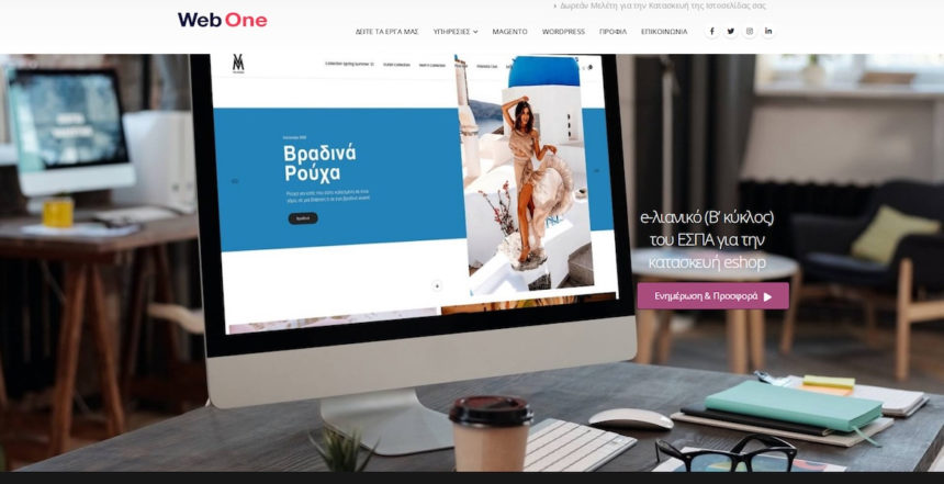
Η WEBONE καινοτομεί και πρωτοπυτεί στον χώρο της Ανάπτυξης Επιχειρήσεων μέσω του διαδικτύου εφαρμόζοντας αποτελεσματικά τις πιο σύγχρονες πρακτικές Web Design, Marketing & Διαφήμισης. Η αποστολή μας είναι να βοηθήσουμε τις εταιρείες να γίνουν πιο επιτυχημένες στον ψηφιακό κόσμο. Για κατασκευή ιστοσελίδων, κατασκυεή eshop και προώθηση ιστοσελίδων ελάτε σε εμάς για χειροποιαστά αποτελέσματα και κερδοφορία.

10/07/21
41187
10/04/21
21800

Positive Impact Studio by Lucie Le Liard  

09/26/21
21155

LinkPool by Together  

09/12/21
28978

Flayks – Portfolio 2021 by Félix Péault  

noop

Noop is creative marketing agency located in Perth, Western Australia.

09/01/21
32263

noop by noop  

08/27/21
29578

Quikclicks by Conrad  

Franky’s

We make hats.

08/06/21
137838

Franky’s by Huig van der Waal  

Litho – Multipurpose Elementor WordPress Theme

Litho is a highly creative and BootStrap 5 responsive, business & shopping, portfolio & blog multipurpose Elementor WordPress theme with 36+ awesome homepages, 200+ customisable elements and 300+ creative templates.

08/04/21
70095
07/31/21
118084

Buba Blocks by eCuras  

Stacked

We’ve always had an idea of building a real estate team that wrote content not for the intention of selling, but to educate. The element of trust, warmth and openness was a main influence in our design.

Being a content-driven website, we decided to focus on an ‘editorial’ concept. We used warm pastel colours to emanate a feeling of homeliness with us. This was in stark contrast to the initial blue/white concept we came up with which we felt was too corporate-looking.

We settled on the dominant colour purple. It’s a very different colour from other real estate companies in Singapore, so this distinction sets us apart. We’ve also chosen several secondary colours that work harmoniously and have different meaning. The use of orange, blue and green represent the different types of housing in Singapore, and we deliberate pick the colours that represent which property type we are focusing on.

The use of lines that curve are common in our editorial. They separate our sections and form a part of our quotes and other icons. The lines dictate the flexibility and separation of space as part of our branding campaign, highlighting the versatility in our real estate expertise and knowledge. Moreover, these lines morph in to various icons such as the type of housing in Singapore – HDBs, condos and landed homes in our other branding assets.

The use of serif fonts here were deliberate. We wanted to give our readers the familiar feel of reading a journal, an editorial, a newspaper. A feel that they’re opening up a classic content that is serious. It is time to be informed.

Our analysis, reviews and insights are derived from original photography, so the site takes advantage of multiple image layouts to bring the best out of our content – especially our reviews.

From our branding, we built a custom WordPress theme that you see here.

We hope you enjoyed this shot of our website.

Home

06/18/21
29768

Stacked by The Candidate  

Bespoke Website Development

iBrandox is into bespoke website development and digital marketing.

05/27/21
127130

Bespoke Website Development by iBrandox Online Pvt Ltd