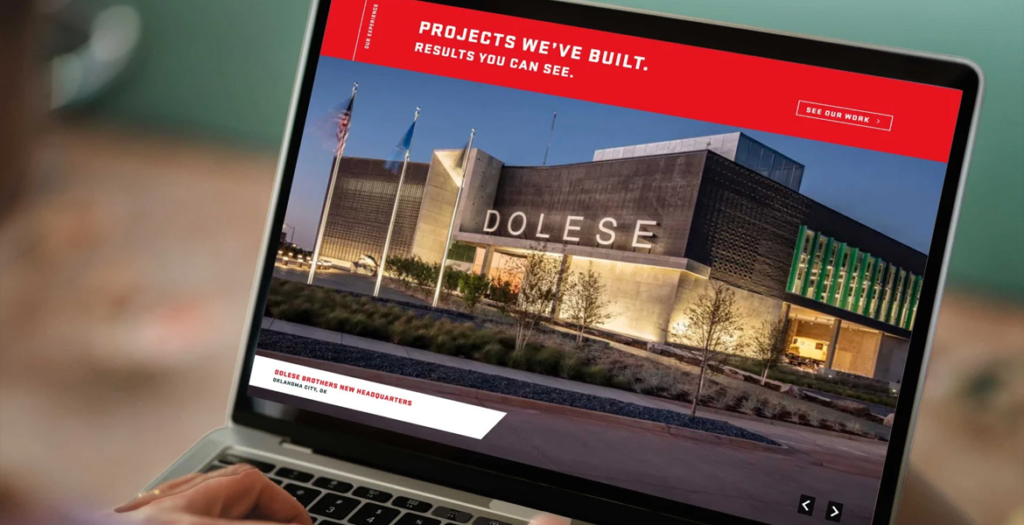
Flintco delivers comprehensive construction services for complex projects around the country. After refreshing the firm’s brand identity to be more modern, bold and reflective of the company’s position, we turned to their website.
The new site is visually striking, but that’s just the beginning. Animation and interactivity guide the visitor as they learn about Flintco and find what they need. The new tagline, “All in. Always.” is palpable, with real jobsite photos, stats and case studies not just telling, but showing, Flintco’s expertise and impact. On the backend, we developed a custom digital brochure builder that makes it easier for Flintco’s business development team to assemble sales materials—customizable but still consistent, and without having to start from scratch every time.
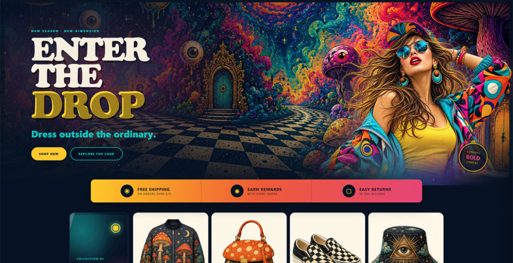
Curio is an eight-page psychedelic fashion store template for independent boutiques and gift shops. Sixteen quick-add product cards sit across four themed collections, backed by a working cart, site-wide search, and shipping, returns, size-guide, FAQ and contact pages. A full-bleed drop hero, trust bar, brand manifesto and newsletter panel complete it. Deep navy with gold, magenta and teal, surreal product images and playful display type. Responsive and easy to edit.
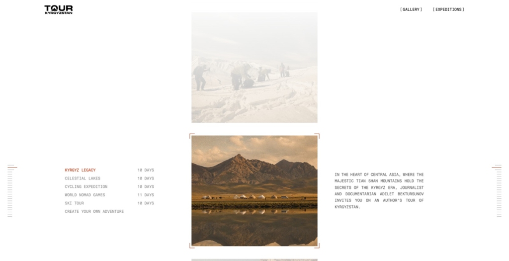
Trekking, cycling, and ski expeditions across Central Asia, shaped by nomadic culture and captured through expedition filmmaking, all carrying the spirit of the mountains.
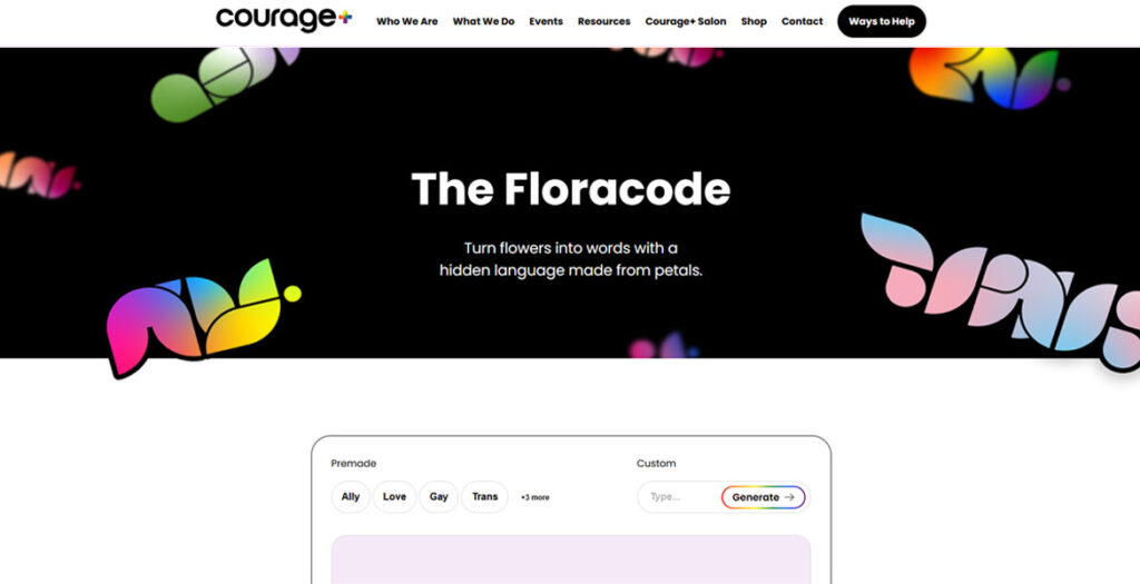
For LGBTQ+ youth navigating environments where open self-expression can invite harm, finding a safe and affirming outlet is not just comfort — it’s a necessity. Floracode was born from that need: a generative graphic tool that translates personal messages into encoded floral imagery, where every letter of the alphabet is mapped to a unique arrangement of flower petals through a rule-based algorithm. Users type any message and the system renders it as a downloadable, fully customizable graphic built on HTML Canvas — adjustable in color, scale, and composition. The result is something that can be shared openly, worn, or displayed, carrying meaning that only those who know the language can read. More than a cipher, it’s a quiet act of defiance and celebration — affirming that communication, community, and identity deserve to bloom, even
Part poetic reflection, part love letter to The Windy City, this site brings together music, location audio, and narrative text to guide users through the Urbs in Horto. Site has a 6-track Web Audio mixer.
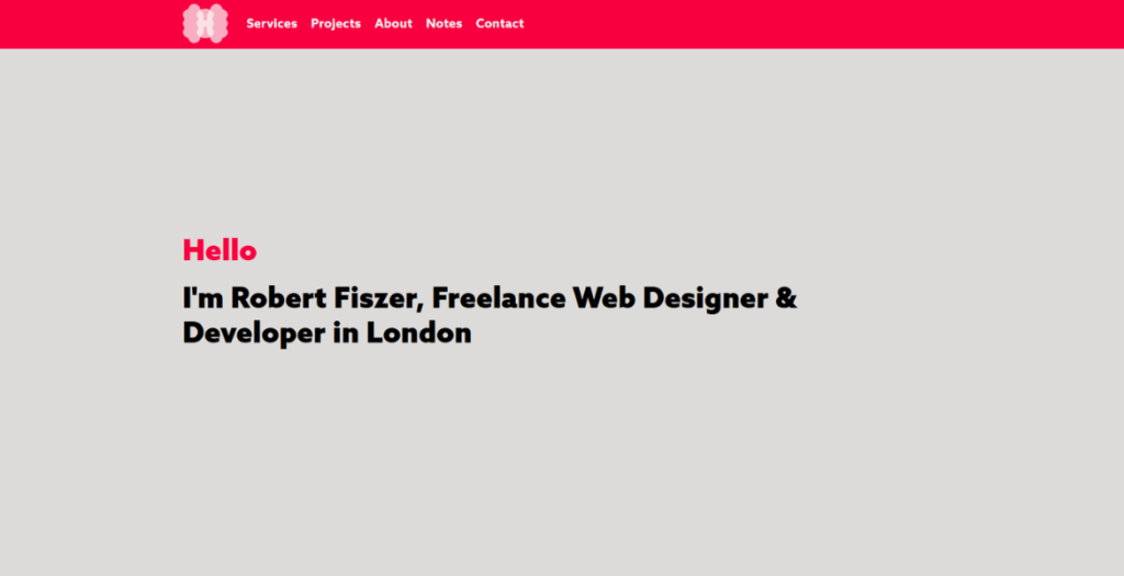
Portfolio of Robert Fiszer, London-based web designer. Built with Kirby CMS to demonstrate the approach: clean design, solid code, fast loading, and no unnecessary complexity.
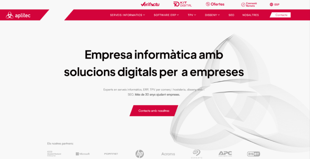
Aplitec Informàtica’s website reimagines the digital presence of a long-standing technology company through bold typography, architectural visual references and dynamic motion design. The interface blends clean layouts, subtle animations and structured content to communicate over 30 years of expertise in ERP software, IT infrastructure, POS systems and digital transformation, creating a modern and engaging browsing experience.
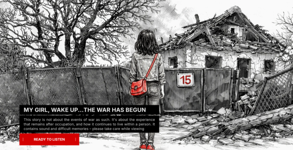
Ukrainska 15 is an interactive long-read that tells a personal story about the first days of the war in Ukraine. The project documents everyday moments, memories, and emotional experiences that often remain outside official narratives.
The website combines storytelling, illustration, and scroll-based interaction to recreate the atmosphere of uncertainty, fear, and resilience people experienced during that time. The narrative moves from darkness to light, symbolizing the journey from the basement during shelling to life continuing above ground.
Through a minimal visual language the project focuses on memory, trauma, and the human side of war. Ukrainska 15 is both a personal archive and a digital story about how ordinary life changes in extraordinary circumstances.
We use cookies to ensure that we give you the best experience on our website. If you continue to use this site we will assume that you are happy with it.