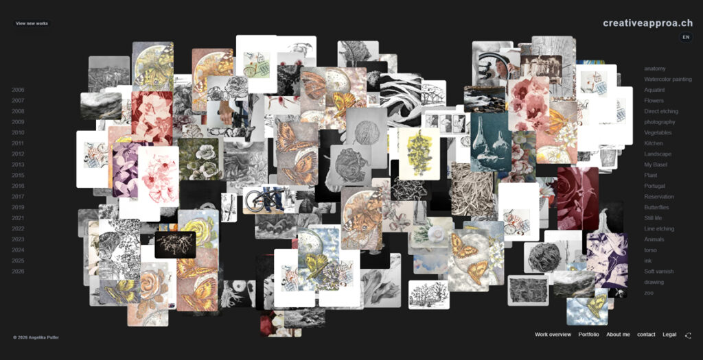
creativeapproa.ch is an interactive artist website by Angelika Pulfer, built around a free-floating image cloud of works, texts and visual traces. Instead of presenting the archive as a fixed chronology, the site invites visitors to move through images by year, motif, technique and association.
The project brings together drawing, printmaking, photography, observation and digital composition in an open web space. Individual works can be explored through focused views, while curated texts offer a second layer of reflection on materials, processes, motifs and recurring forms. The result is both an artist portfolio and a living archive: quiet, exploratory and shaped by the act of looking.
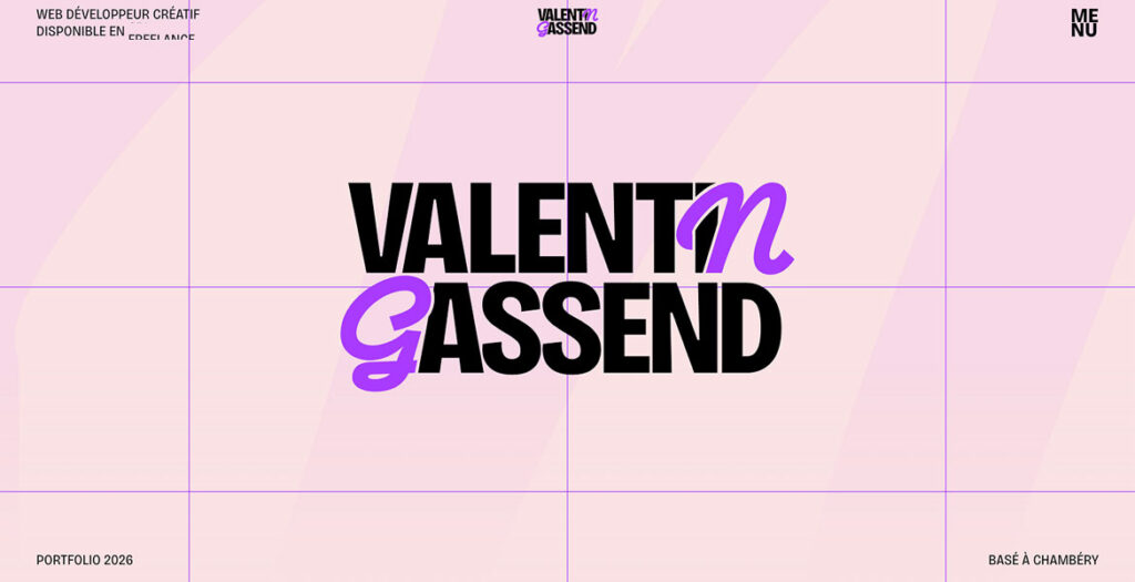
Portfolio of Valentin Gassend, a freelance Creative Developer specializing in immersive web experiences. Built with Next.js, the site explores the intersection of design and code through custom WebGL shaders (React Three Fiber), advanced kinetic typography (GSAP), and smooth scrolling interactions. It features in-depth case studies and a dedicated experimental “Lab” for front-end R&D.
A strategic website redesign for Somerstone Property Group – evolving a founder-led business into a trusted collective to build wealth with confidence.
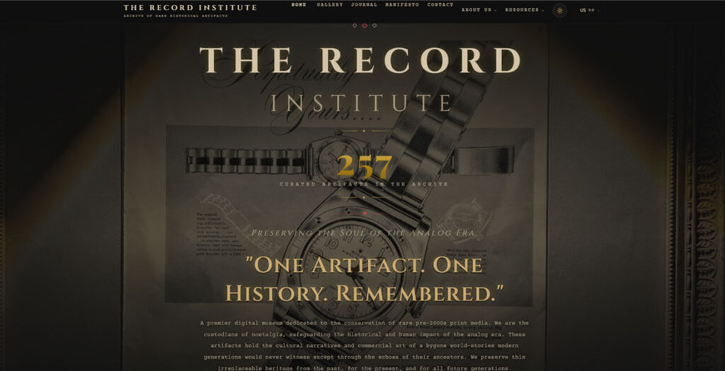
The Record Institute is a specialized digital museum and archival platform dedicated to the preservation and study of original print advertisements from the 1930s through the 1990s. Operating at the intersection of historical preservation and digital innovation, the site serves as a sanctuary for “The Aesthetics of Decay,” showcasing original single-sheet artifacts extracted from iconic publications. Through high-fidelity rendering, magnifying zoom capabilities, and an academic narrative, the platform elevates commercial ephemera into a recognized form of historical art, emphasizing the tactile soul of paper that predates the digital revolution.
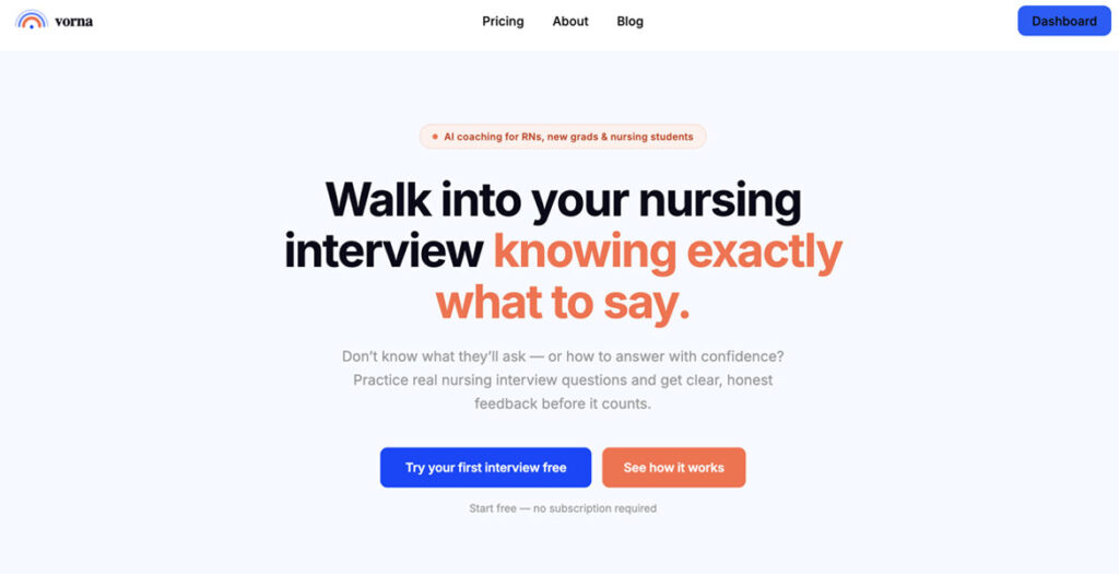
Vorna is an AI-powered mock interview platform built specifically for the nursing profession, moving beyond generic career advice to focus on the high-stakes reality of the hospital floor. By simulating real-world clinical scenarios tailored to specific units- like the ICU, ER, or specialized roles like Infection Prevention – the tool helps nurses practice their answers out loud and receive instant, objective feedback.
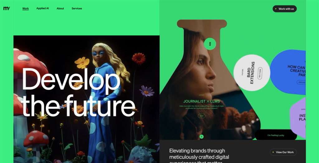
Metajive redesigned its website to create a more intentional, editorially driven digital presence that better reflects the depth of the studio’s creative, technology, and AI capabilities. The new experience brings greater clarity, rhythm, and sophistication to how the brand and its work are presented, pairing visual restraint with thoughtful motion and a more disciplined content structure. The result is a polished, contemporary platform that feels both elevated and highly functional.
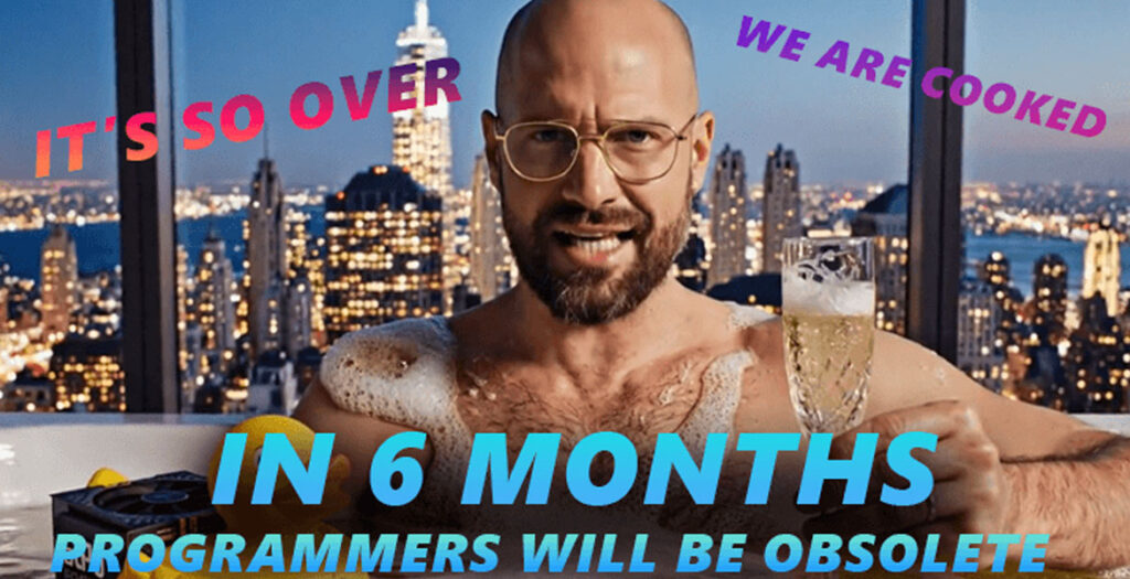
The end of human coding is coming in 180 days. Every day, a CEO of the hottest AI company will make a prediction of our demise. Vote for the predictions — let’s see which CEO wins the race.
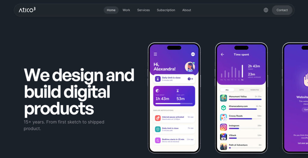
A modern UI/UX portfolio showcasing user-centered design projects across web and mobile platforms. The website focuses on clean layout, strong visual hierarchy, and usability, presenting case studies in a clear and structured way.
Built with a minimalist approach, the design emphasizes readability, responsive behavior, and smooth user experience, highlighting work in SaaS, fintech, and product design.
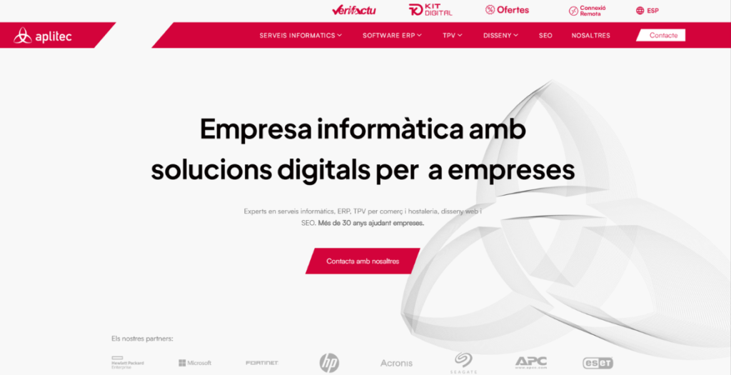
Aplitec Informàtica’s website reimagines the digital presence of a long-standing technology company through bold typography, architectural visual references and dynamic motion design. The interface blends clean layouts, subtle animations and structured content to communicate over 30 years of expertise in ERP software, IT infrastructure, POS systems and digital transformation, creating a modern and engaging browsing experience.
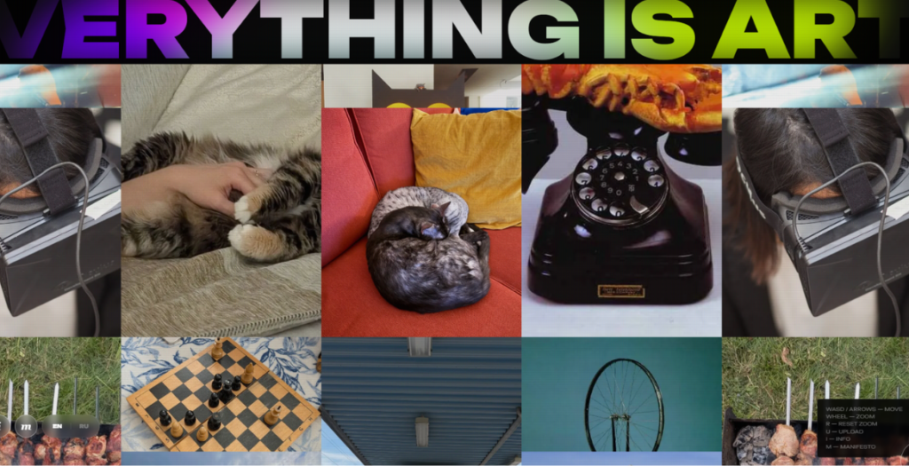
Everything Is Art is a project that turns your everyday life into a modern art manifesto. Upload a photo and receive a sharp and pretentious description in the style of an art critic from Tate Modern.
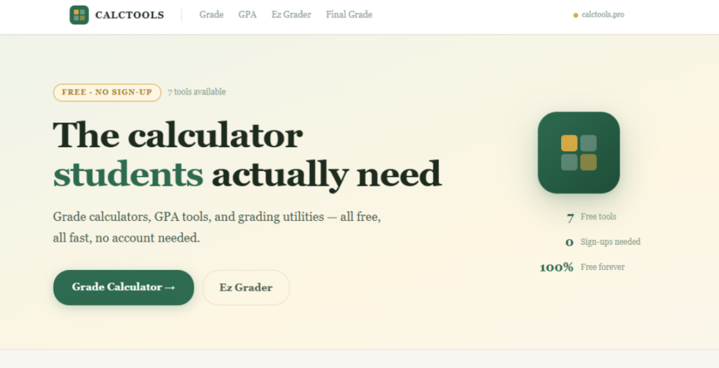
CalcTools provides free, easy-to-use calculators designed for students at every level – from middle school and high school to college and university. Our most popular tool, the grade calculator, lets you instantly calculate your weighted or unweighted grade across any number of assignments, quizzes, and exams.
We use cookies to ensure that we give you the best experience on our website. If you continue to use this site we will assume that you are happy with it.