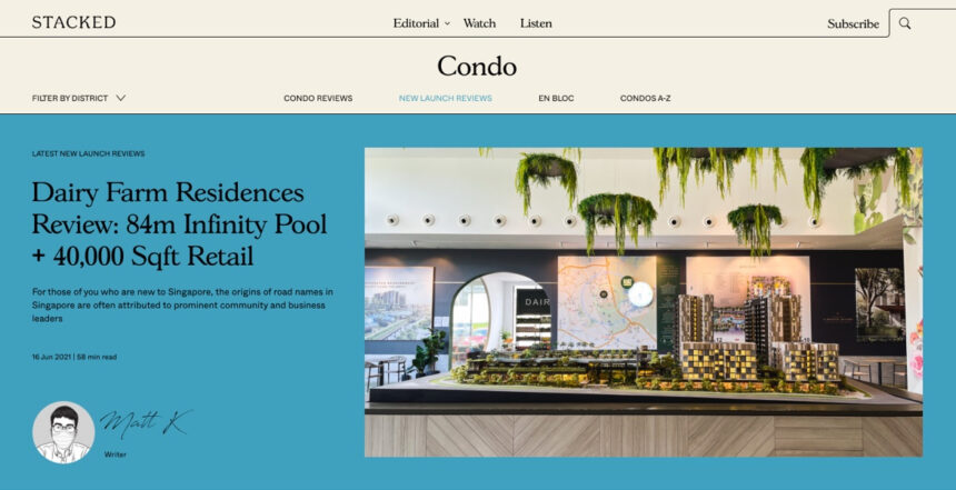
We’ve always had an idea of building a real estate team that wrote content not for the intention of selling, but to educate. The element of trust, warmth and openness was a main influence in our design.
Being a content-driven website, we decided to focus on an ‘editorial’ concept. We used warm pastel colours to emanate a feeling of homeliness with us. This was in stark contrast to the initial blue/white concept we came up with which we felt was too corporate-looking.
We settled on the dominant colour purple. It’s a very different colour from other real estate companies in Singapore, so this distinction sets us apart. We’ve also chosen several secondary colours that work harmoniously and have different meaning. The use of orange, blue and green represent the different types of housing in Singapore, and we deliberate pick the colours that represent which property type we are focusing on.
The use of lines that curve are common in our editorial. They separate our sections and form a part of our quotes and other icons. The lines dictate the flexibility and separation of space as part of our branding campaign, highlighting the versatility in our real estate expertise and knowledge. Moreover, these lines morph in to various icons such as the type of housing in Singapore – HDBs, condos and landed homes in our other branding assets.
The use of serif fonts here were deliberate. We wanted to give our readers the familiar feel of reading a journal, an editorial, a newspaper. A feel that they’re opening up a classic content that is serious. It is time to be informed.
Our analysis, reviews and insights are derived from original photography, so the site takes advantage of multiple image layouts to bring the best out of our content – especially our reviews.
From our branding, we built a custom WordPress theme that you see here.
We hope you enjoyed this shot of our website.
Home